Craves
A FLAVOR OF PACKAGING ALL ITS OWN
See how Magnetic cooked up a packaging redesign that stood out on shelves and spoke clearly to snack lovers everywhere.
hungry to evolve
Rebranding Craves for a Modern Snack Market
Craves, part of the Jumbo Brands family, wanted to trade outdated packaging for a more premium and visually appealing identity. The existing design struggled to grab attention in today’s competitive snack aisle, limiting the brand’s potential.
Our objective was to create a fresh, modernized look that would:
- Resonate with modern consumers while maintaining brand loyalty.
- Elevate the brand’s positioning in the snack industry, giving it a high-end feel.
- Enhance shelf appeal with modern, eye-catching packaging.
- Communicate indulgence and quality, making Craves the go-to choice for snack lovers.

clean & memorable
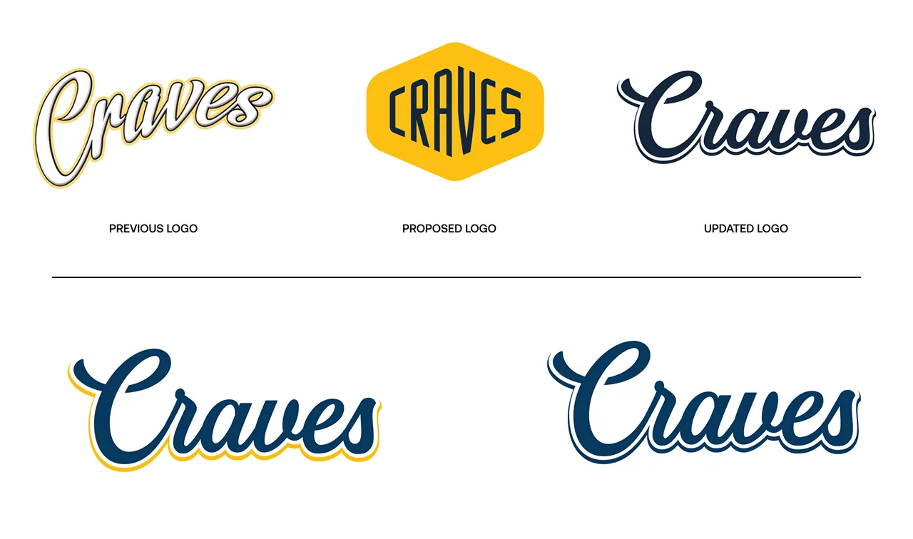
Conceiving a Logo That’s Easy to Crave
The new Craves logo brings clarity and confidence to the snack aisle, reflecting the brand’s modern evolution without losing its approachable character. Streamlined typography and cleaner lines increase readability from store shelves, while the balanced design ensures flexibility across different packaging styles. This updated identity positions Craves as a premium yet accessible snack – one that snack lovers instantly recognize and reach for.

snack time is all grown up
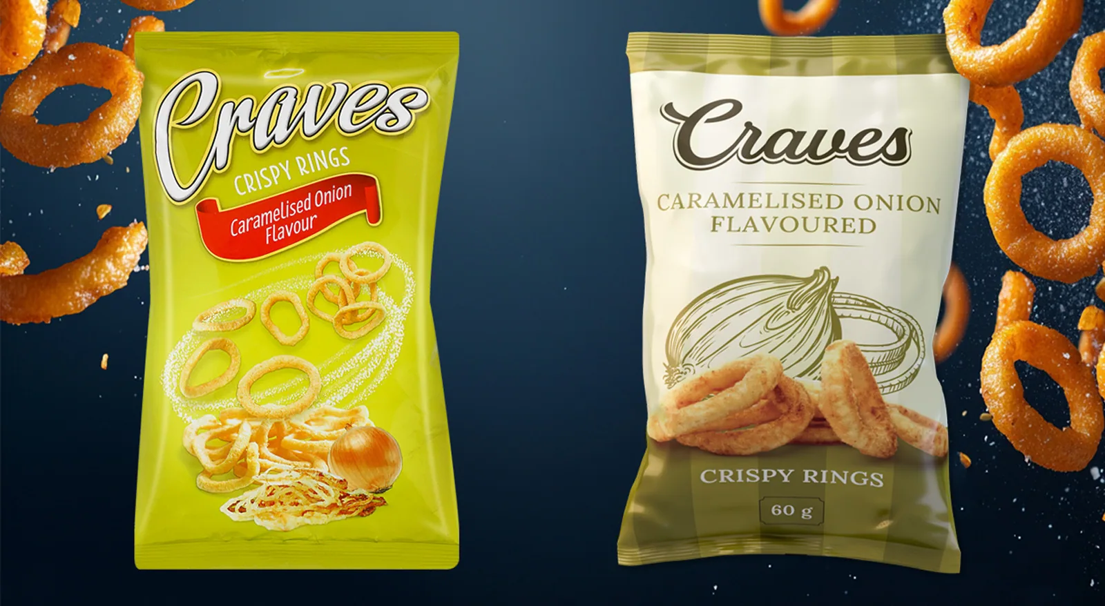
A Crisp That Commands Attention
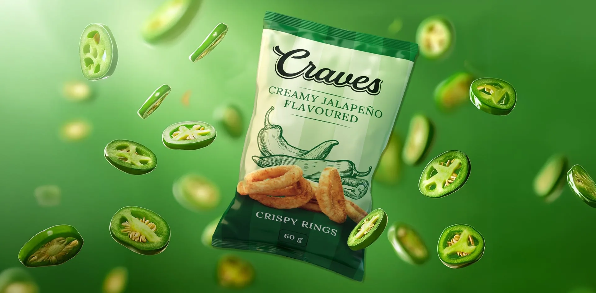
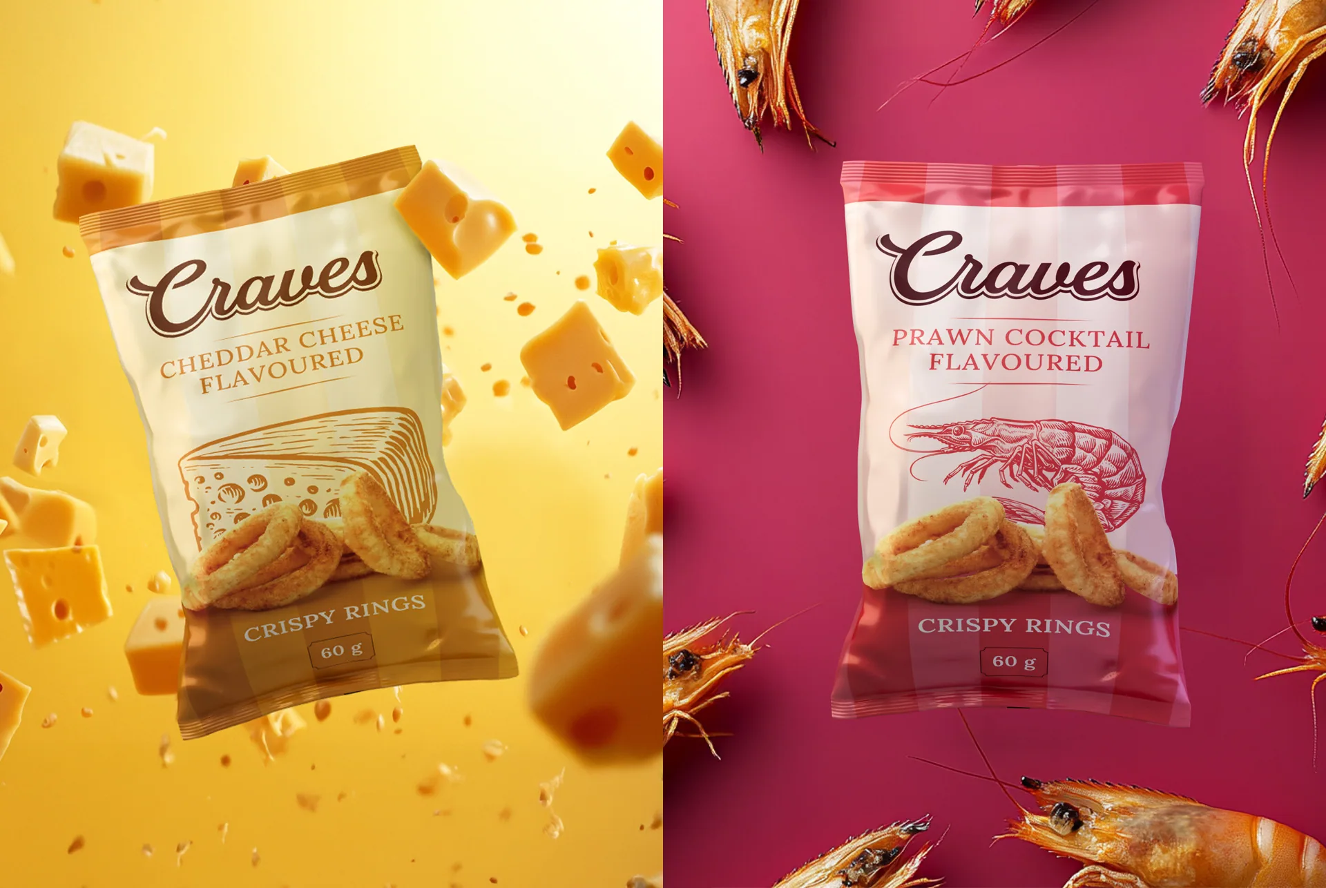
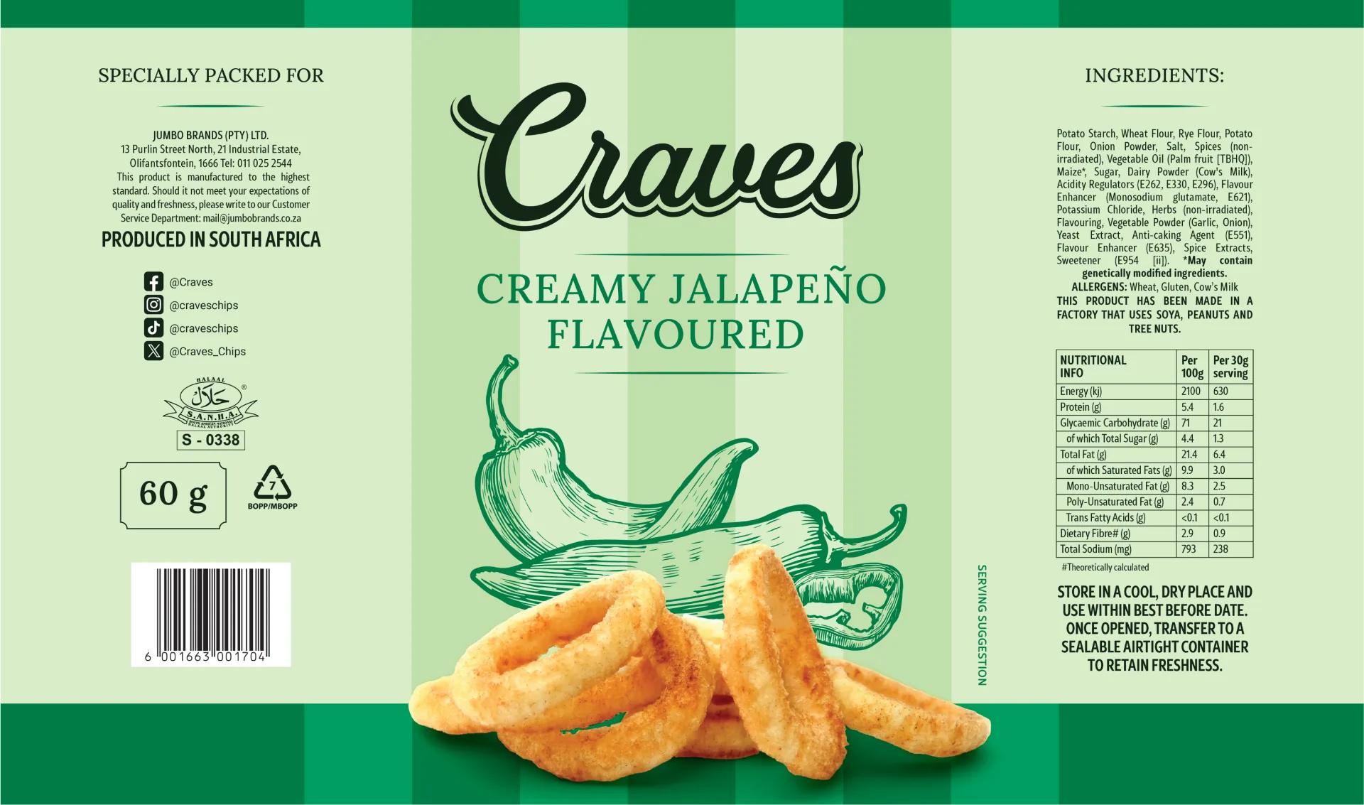
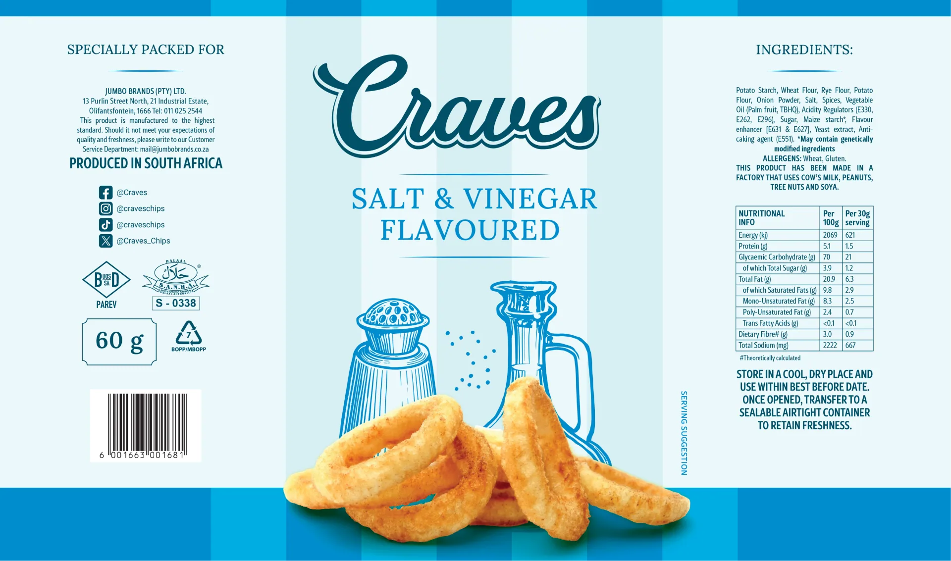
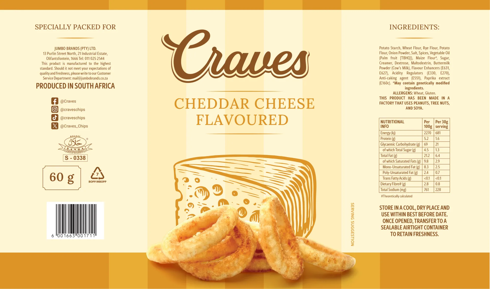
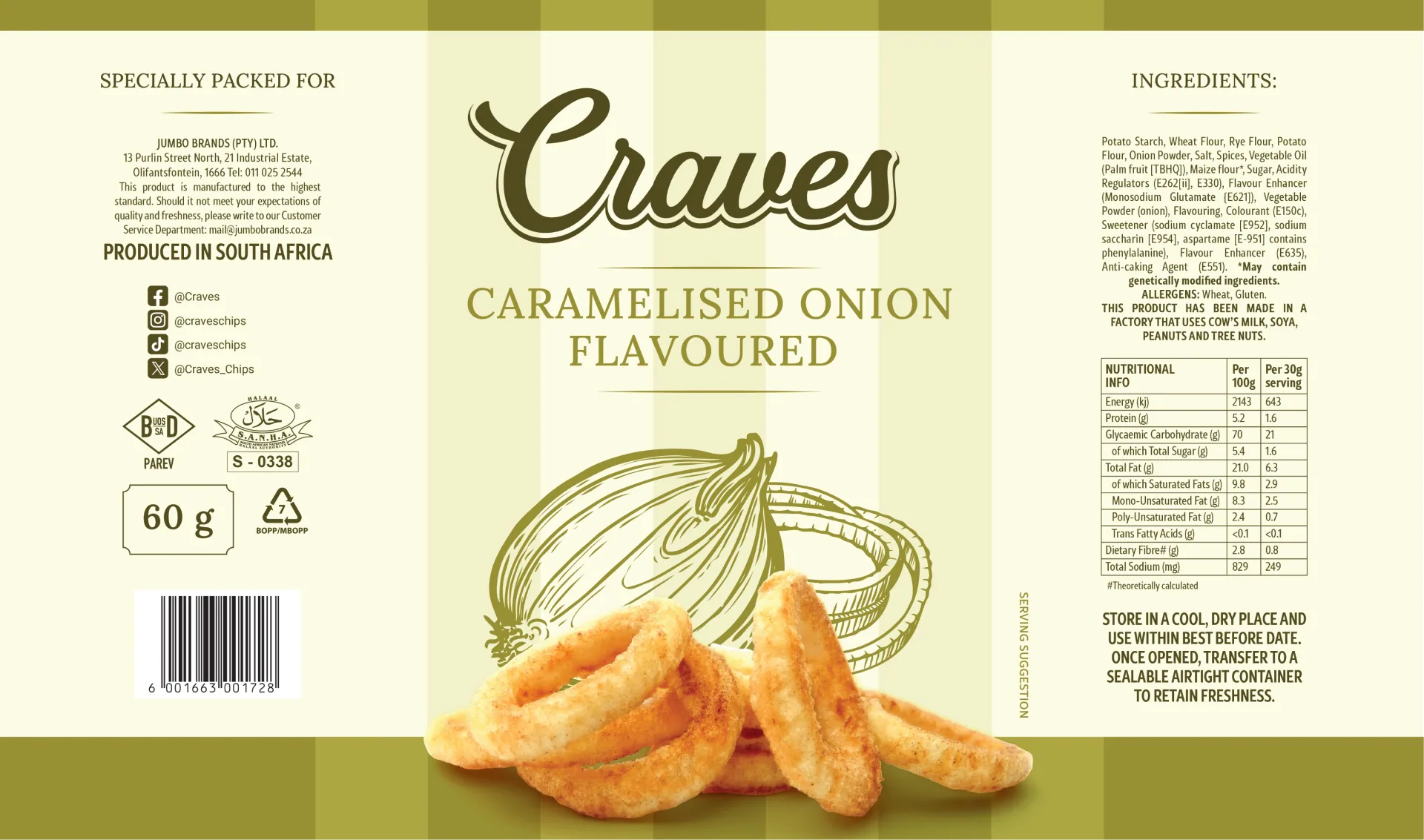
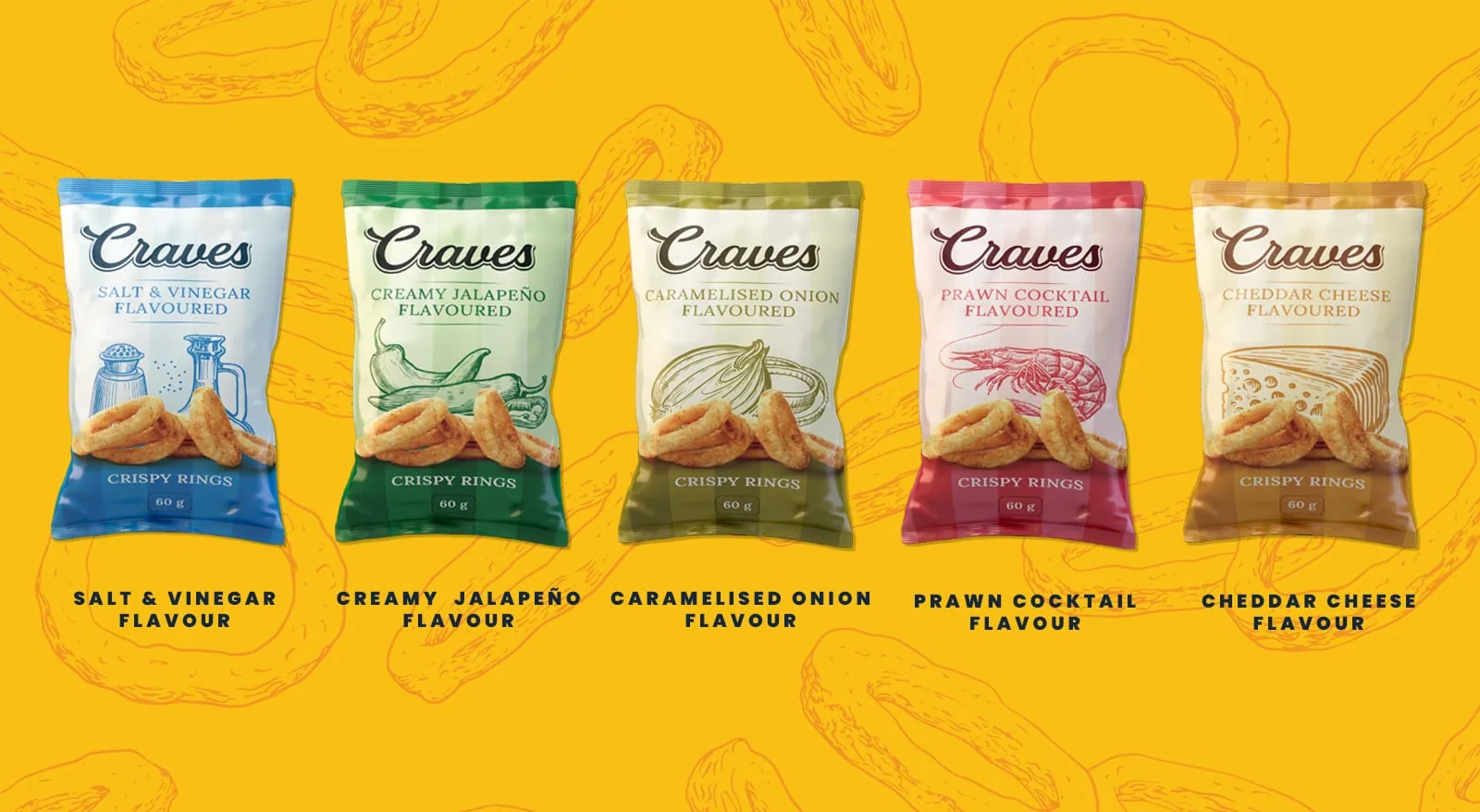
The previous Craves packaging, with its overly bright colors and dated style, struggled to connect with today's snack consumer. Our redesign replaced visual clutter with clean typography, modern elements, and an appealing, balanced color palette. The result is packaging that clearly communicates quality, indulgence, and flavor – making Craves impossible to overlook in crowded snack aisles.

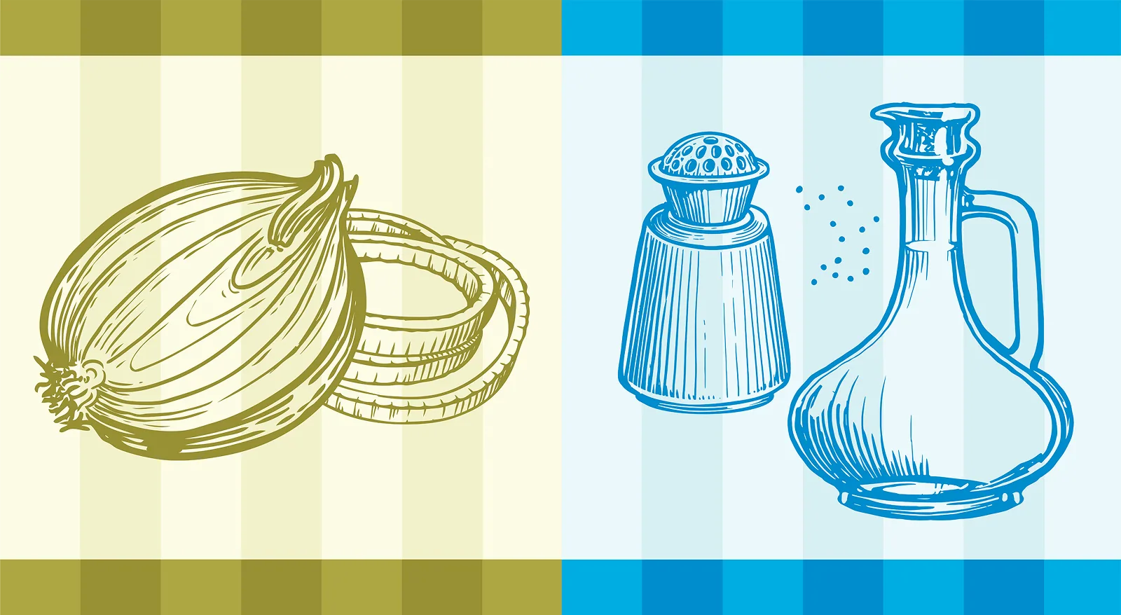
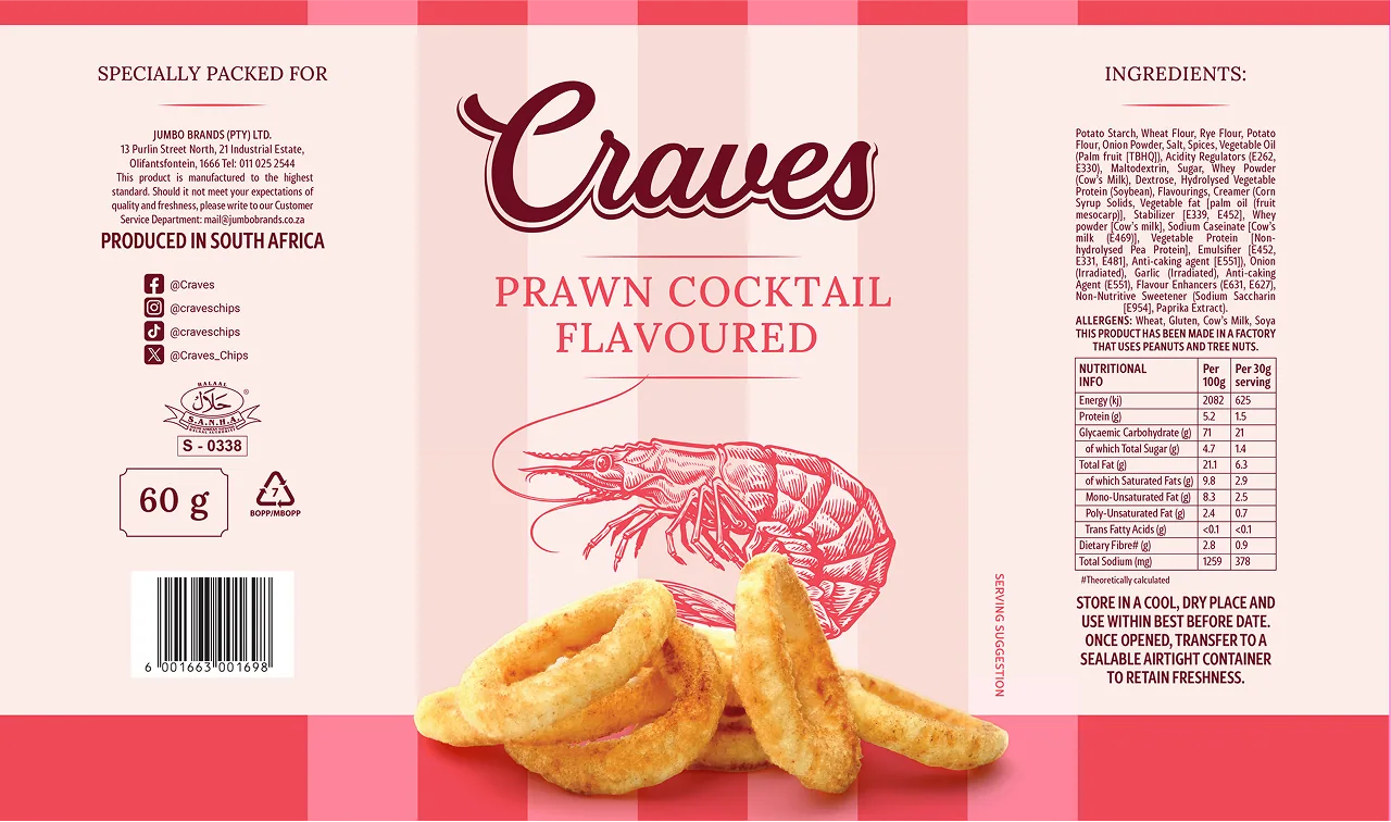
Show, Don't Tell
Each Craves flavor is enhanced by clean, playful illustrations that instantly communicate taste at a glance. Thoughtfully crafted icons and subtle graphics reinforce flavor cues clearly and memorably, adding personality and approachability to the packaging. This visual strategy creates a cohesive identity that connects with snackers, turning every bag into an engaging, sensory experience.






Tasty, Tasty Typefaces
Choosing a Font That Hits the Spot
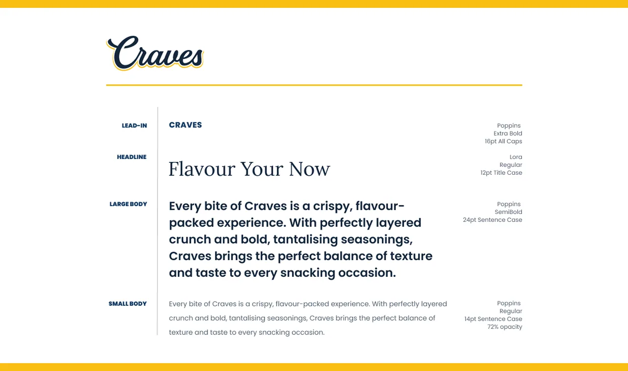
The typography for the Craves rebrand was carefully chosen to reflect its modern and premium feel. A clean, contemporary sans-serif keeps the brand approachable, while a refined serif adds a tasteful touch of indulgence. Together, these typefaces balance style and clarity, making Craves easy to spot and even easier to crave – solidifying its place as a top snack choice on store shelves.

The Moment it all came together
Packaging That Finally Feels Like Craves
The redesigned Craves packaging introduced muted colors and an understated elegance, anchored by a structured, thoughtfully considered layout. Yet, despite these significant changes, the moment the new packs arrived on shelves, they felt immediately familiar – recognizable – as if this was always how Craves was meant to look.
Just like the satisfying crunch you get from that first bite, great packaging has the power to keep you coming back again and again. It’s not just a new aesthetic. It’s the perfect fit – the true identity of Craves, finally realized.



Brand Intelligence
- Brand Strategy + Development
- Naming + Logo Design
Creative Development
- Packaging Design
- Photo + Video Production
- Brand Asset Creation