Koi
Koi CBD Branding Case Study
Magnetic was tasked to build a branding design system flexible enough to capture the full spectrum of wellness, from calming CBD to elevated THC.
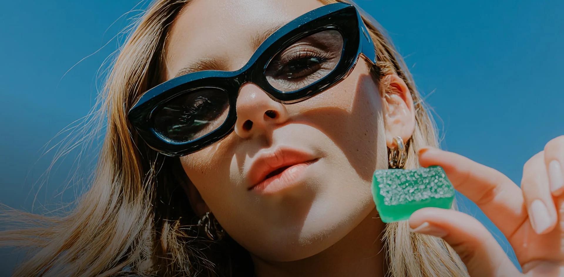
A Spectrum of visual language
Designing a Brand Framework for the Modern Cannabis User
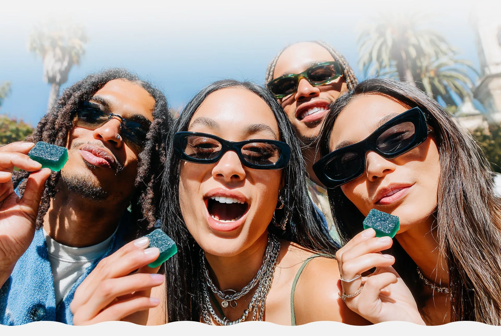

Capturing Aspirational Branded Lifestyle Photography
Feel Good. Live Better.
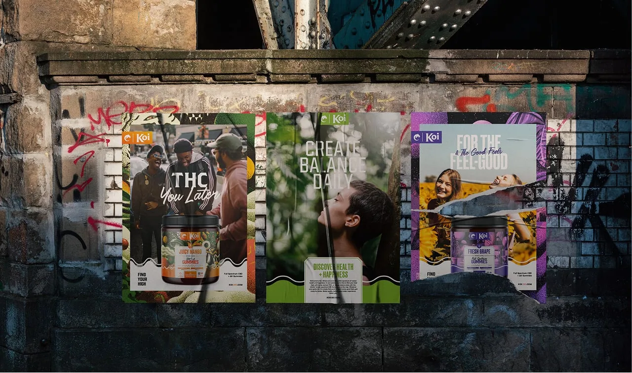
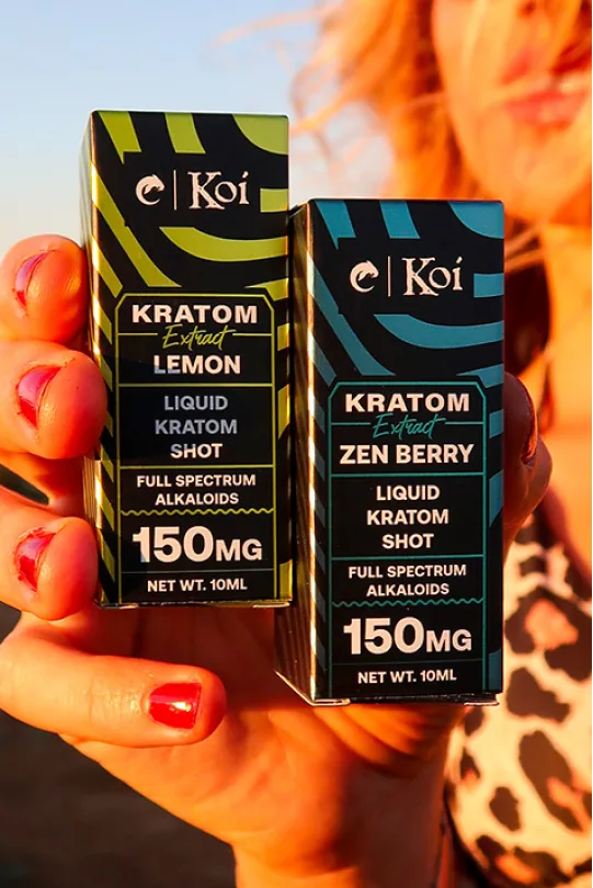
Our photographic approach visually translates the aspirational feelings associated with Koi products. Beginning with an equally balanced moodboard, we sought to capture real people of diverse ages authentically enjoying balanced and fulfilling lives. This photography range showcases everything from calm and wellness to excitement and elevation, resonating deeply with audiences seeking both health and happiness.


REfined toward iconic
Evolving the Koi Logo
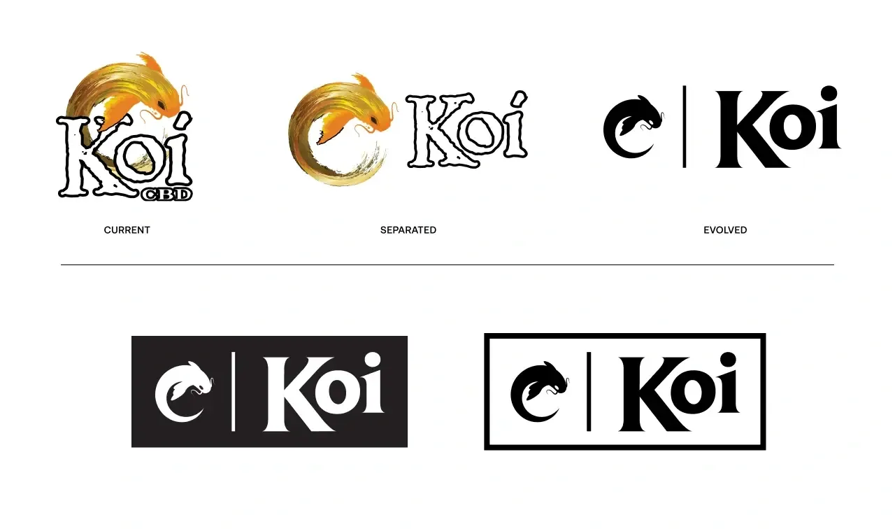
Though recognizable, the legacy Koi logo faced limitations in its complexity and outdated typeface reminiscent of Papyrus. Our evolved logo design unlocks the iconic Koi fish from its restrictive form, delivering a simplified, versatile one-color mark. The new logotype features clean, modernized typography, ensuring the brand identity maintains integrity and flexibility across all applications.
The refined Koi logo retains its heritage while introducing a stronger, simplified aesthetic. By using an easily recognizable silhouette within a defined shape, the brand identity gains increased visibility and adaptability. As Koi continues to grow, this iconic logo mark positions the brand firmly at the forefront of the wellness market.

Visualizing the experience
Designing the Visual Product Experience
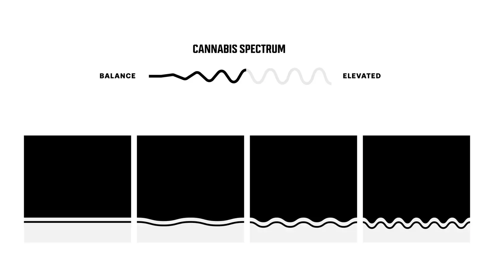
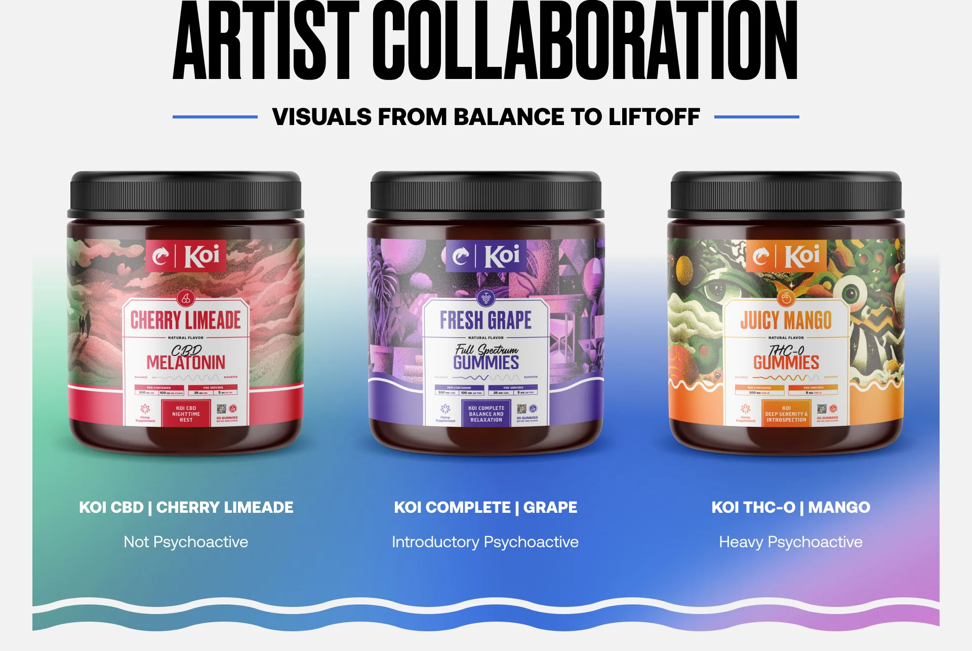
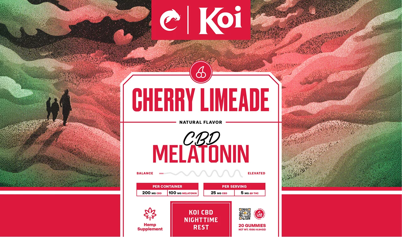
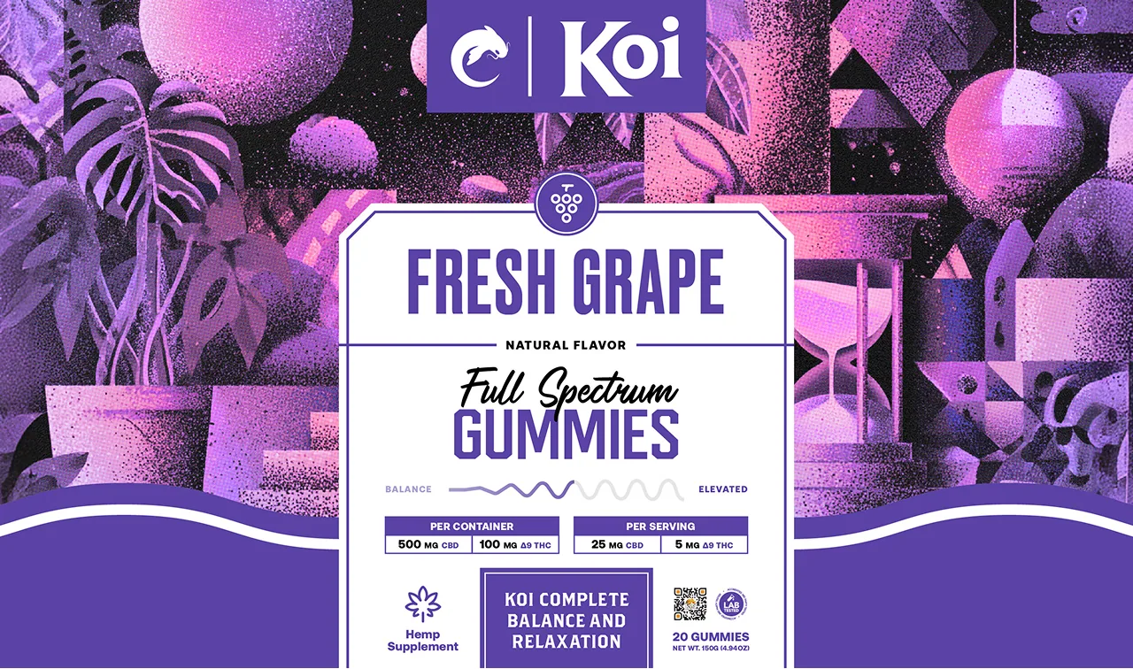
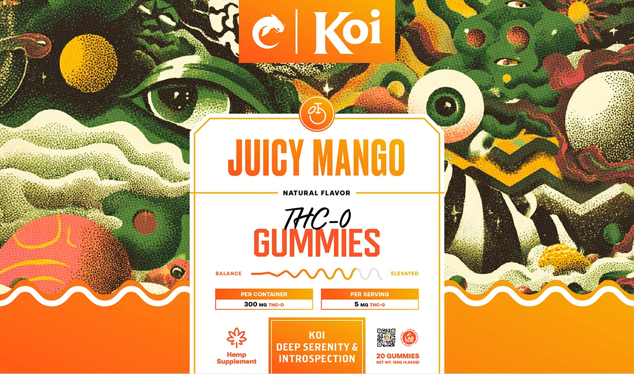
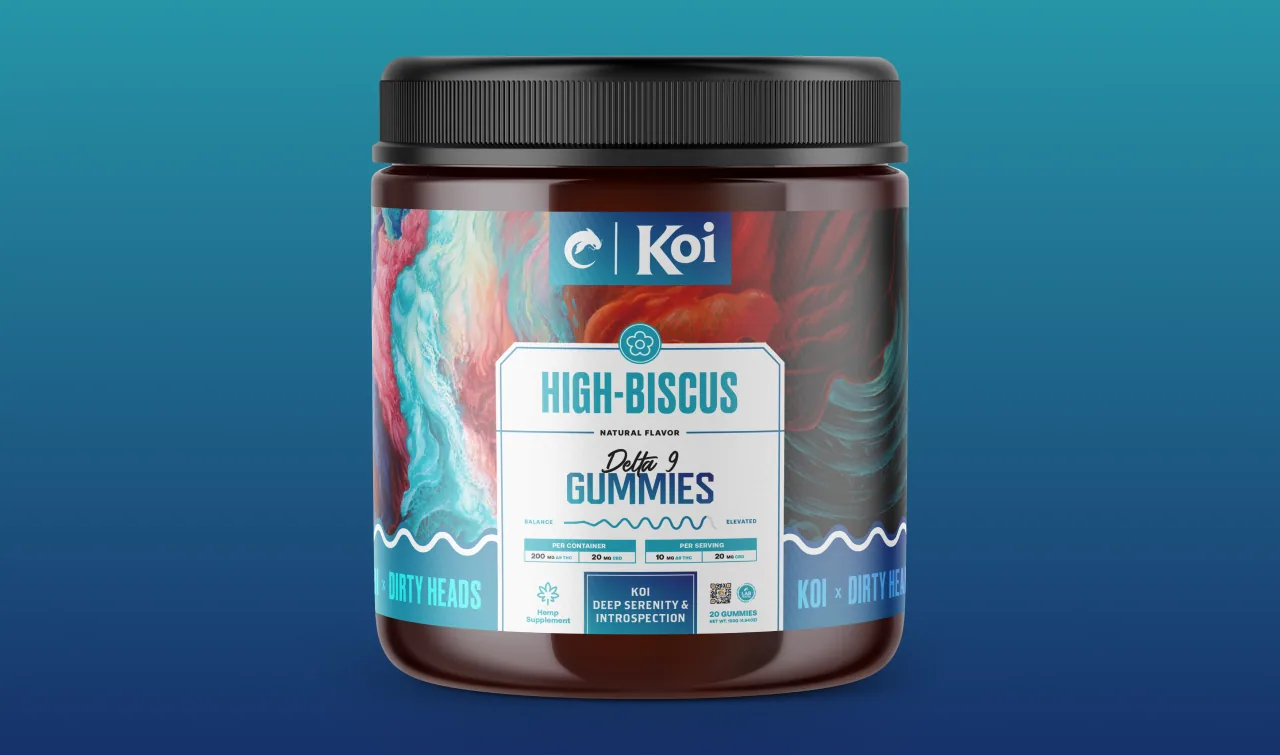
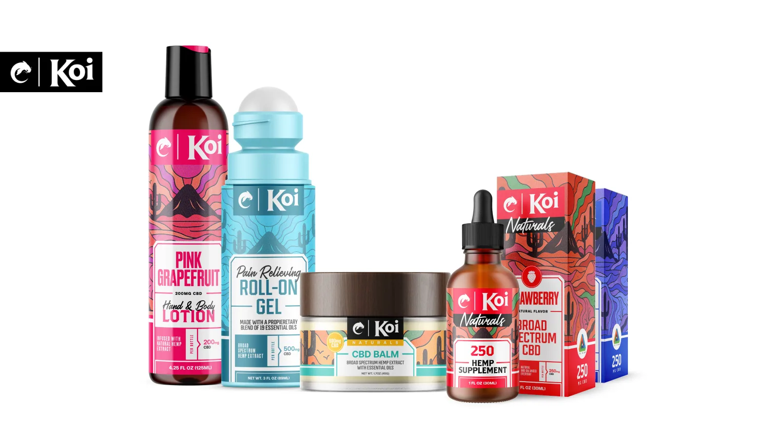
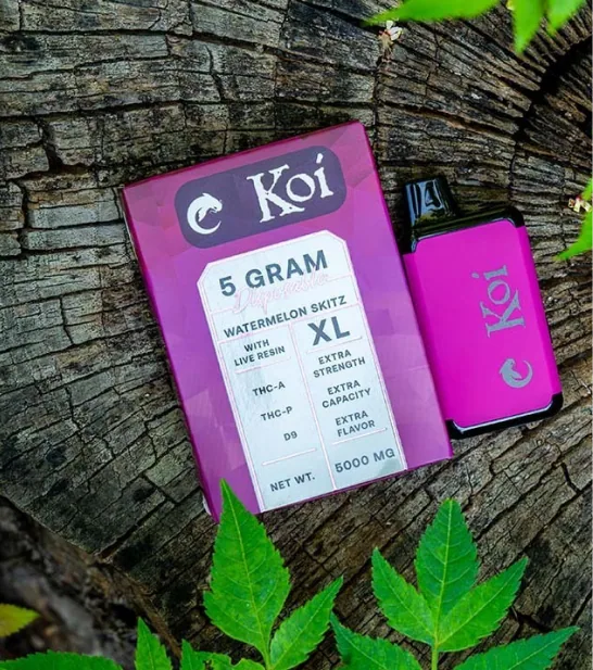
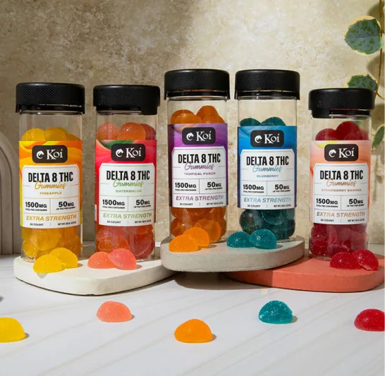
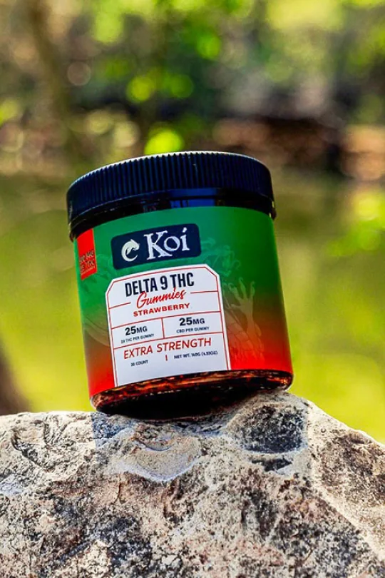
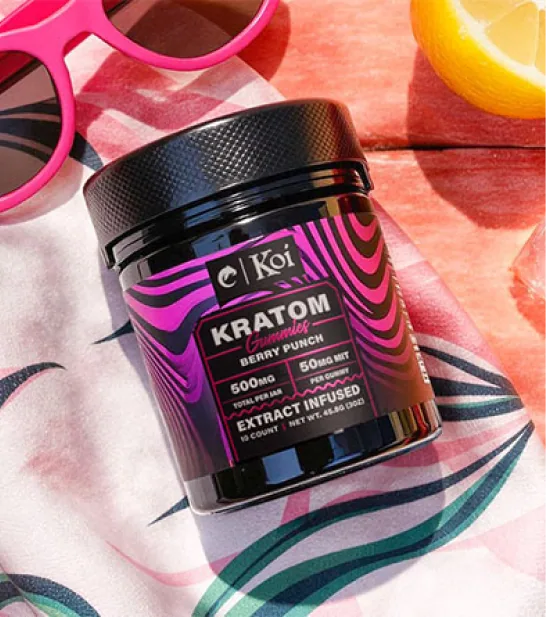
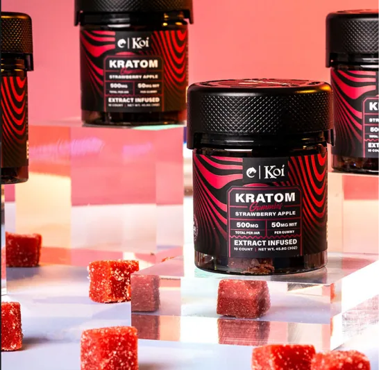
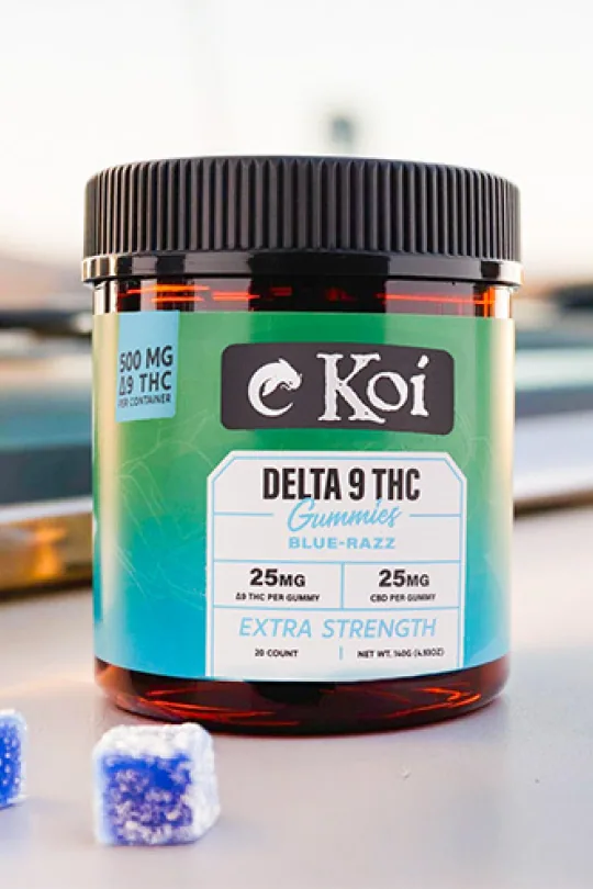
Each Koi product label features vibrant illustrations that visually express the experiences associated with their use – be it sleep, focus, or elevation. Above a distinct dividing line, these dynamic visuals immerse customers in each product's unique world. Below, flavor-specific colors anchor the design, clearly indicating the intended product experience and intensity.

Artist collaborations
Expanding Koi’s Circle
By viewing each label as a blank canvas, we opened the door to opportunities for collaboration with renowned artists and illustrators. This flexible approach allows Koi packaging to remain fresh and culturally relevant, all while maintaining essential product information clearly and consistently.




Fonts & Typography
For a More Balanced Brand Delivery
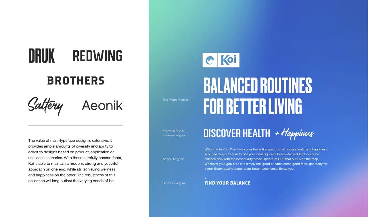
We carefully curated a robust typography system to accommodate the diverse needs of Koi’s expanding portfolio. These thoughtfully chosen typefaces balance modern, youthful energy with wellness-oriented clarity, ensuring consistency across various products, applications, and marketing channels.


the (Pre) Rollout
Making a Splash in the Cannabinoid Space
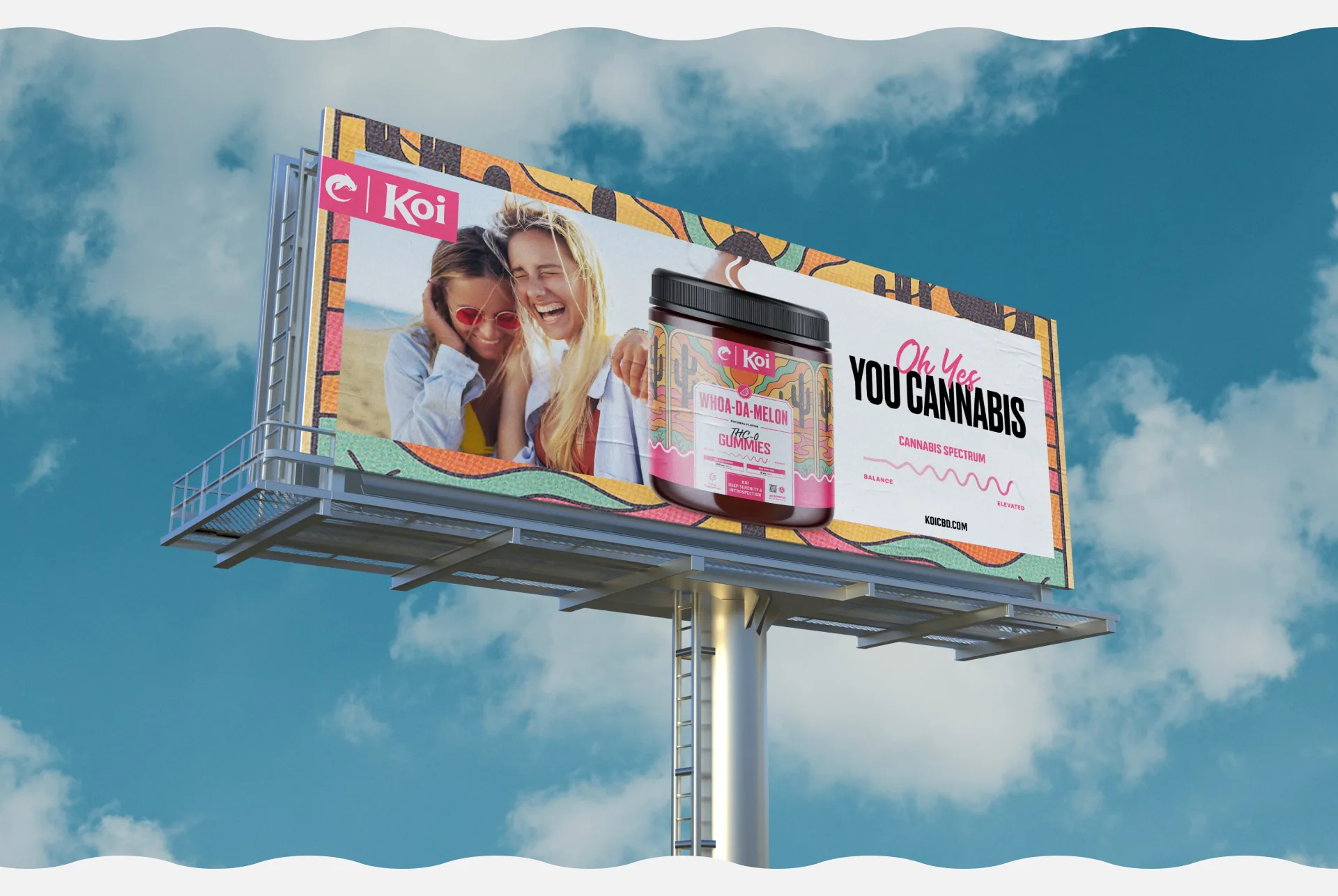
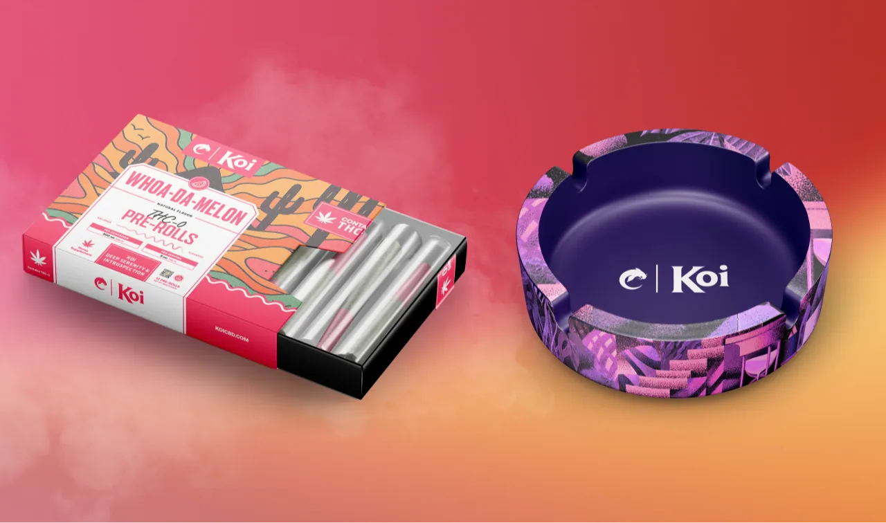
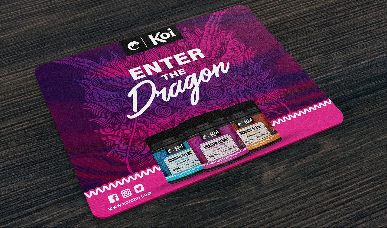
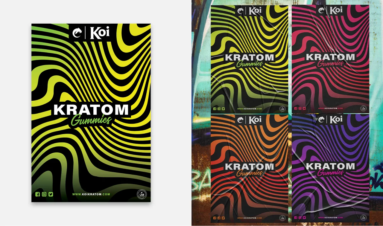
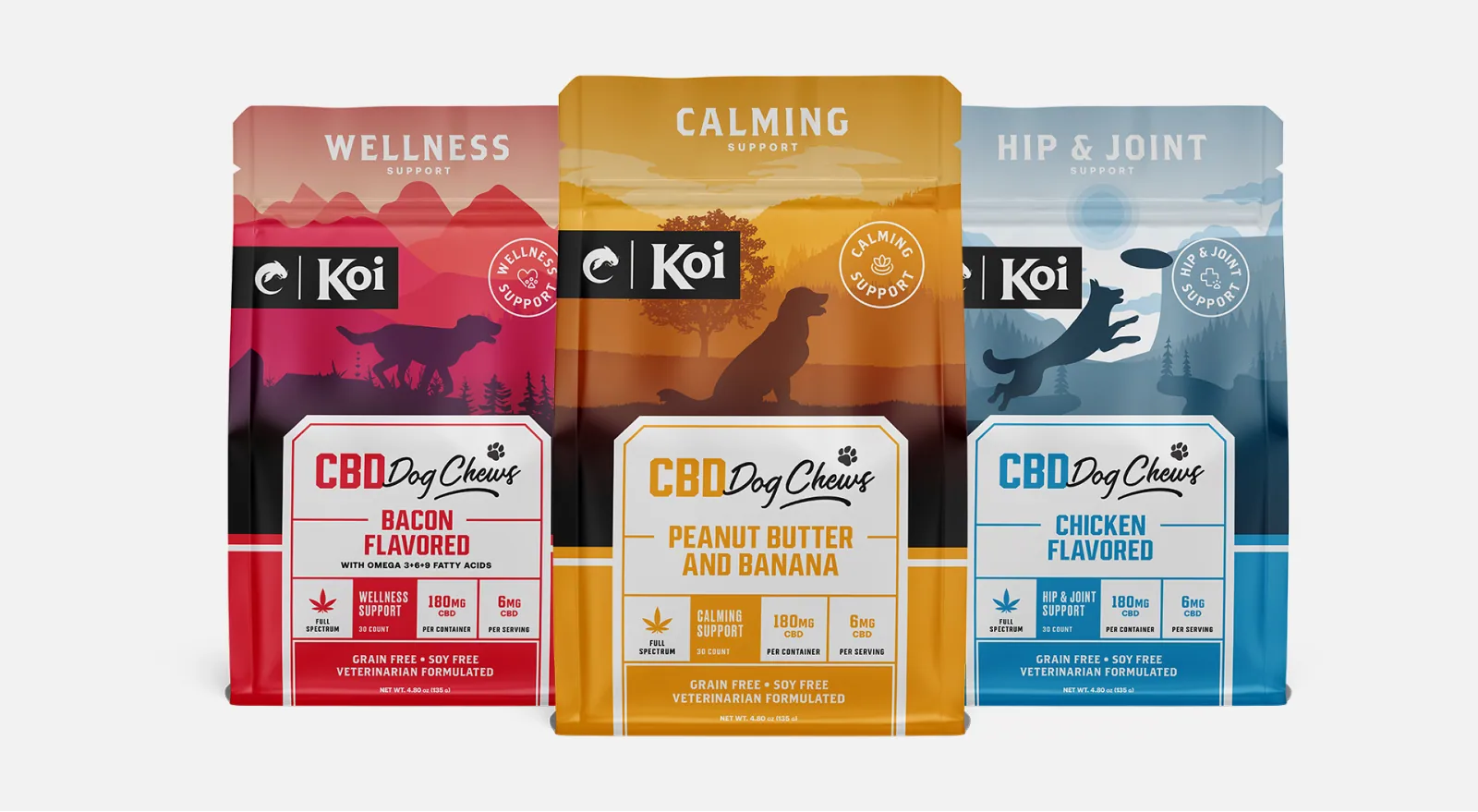
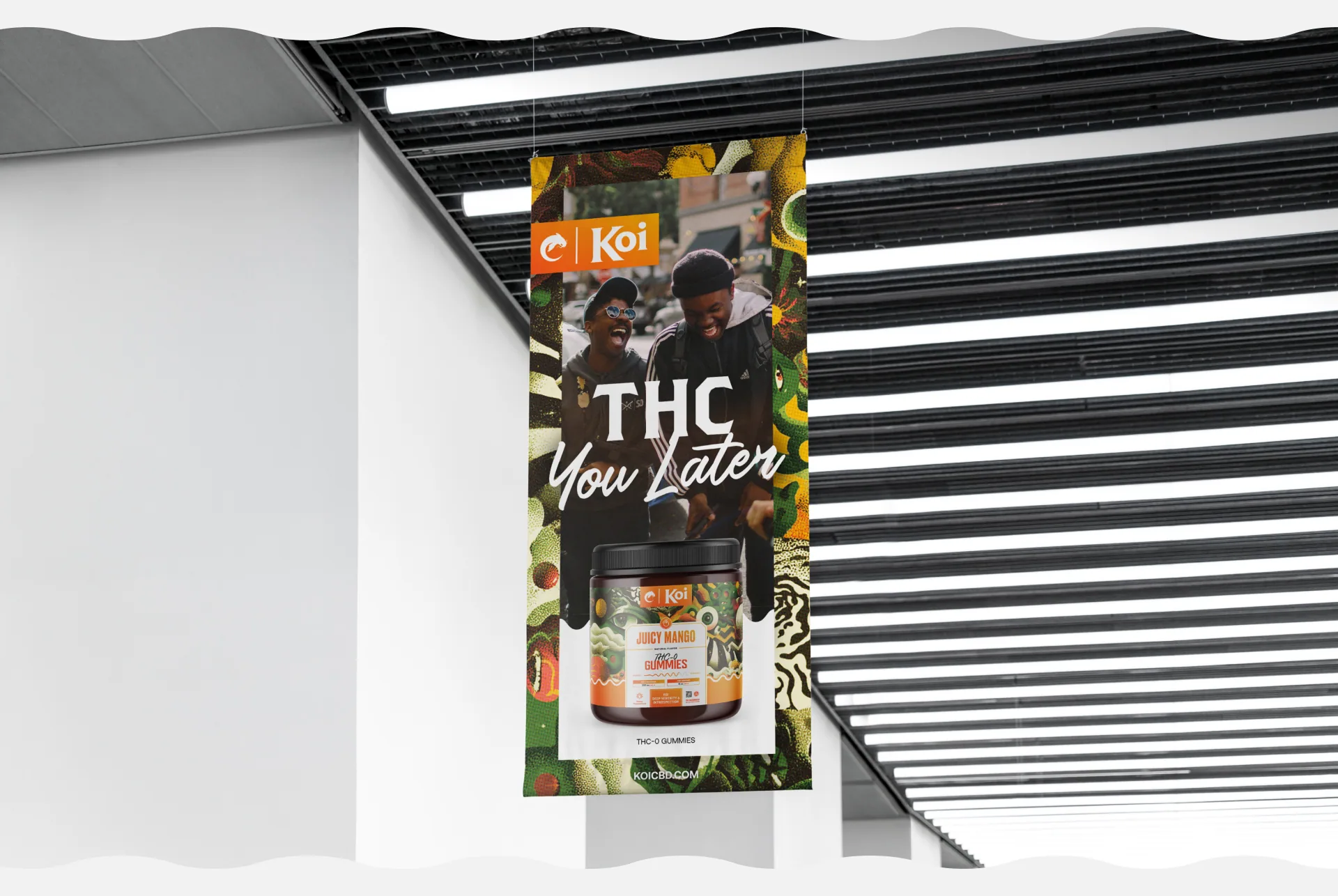
With the new identity locked in, we shifted from refinement to real-world expression. We rolled out bold new packaging, promotional posters, pre-roll wraps, and product displays that brought Koi’s evolved personality to life across every shelf and screen. Each touchpoint was used to reinforce a unified voice, aesthetic, and attitude.







Future-proof by design
Flex Now. Flow Later.
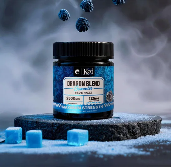
As Koi’s offerings grow, the design system MAGNETIC installed is built to meet each moment without compromising the brand’s clarity or character. Each new SKU can pull from a toolkit of heady illustrations, flavor-first palettes, and modular elements designed to scale.
Whether it’s a new flavor drop or a flagship expansions, Koi’s identity is already there.
Clear, credible, and unmistakably its own.









Brand Intelligence
- Brand Strategy + Development
- Research + Discovery
- Naming + Logo Design
Creative Development
- Creative Dev + Messaging
- Packaging Design
- Website Design + Dev
- Photo + Video Production
- Brand Asset Creation