Pamec Winery
Let your Spirit Escape the Ordinary.
Magnetic helped an Argentine winemaking family establish their wine roots in Temecula by developing a brand and spirit inspired by local lore. From name to identity, we crafted a story that honors the land, reflects their values, and sets them apart in the Temecula Valley wine scene.
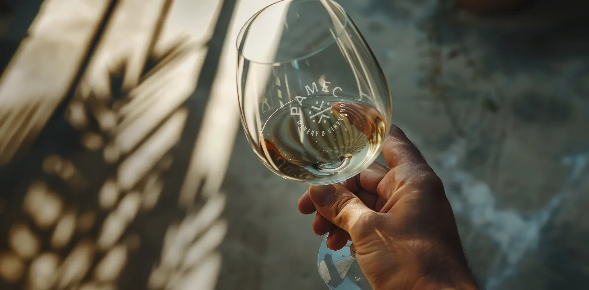
Bringing PAMEC to Life
A Story of Rooted Myth and Modern Magic
When a multigenerational winemaking family from Argentina arrived in Temecula Valley, they brought more than just vines, they brought vision. Intent on planting new roots in Southern California’s vibrant wine country, they came to Magnetic with a dream: to create a winery that felt deeply connected to its new home, while honoring the heritage and craftsmanship they carried across continents.
But they didn’t want to simply blend in.
They wanted a brand that would stand out in a saturated market, one that felt timeless, grounded, and uniquely Temecula, even as it reflected their own legacy.
That’s where Magnetic came in.
Through collaborative discovery sessions, storytelling workshops, and a deep dive into the natural and cultural history of the region, we helped craft not just a brand, but a story, one that could root this new chapter in something bigger than wine.
And so, PAMEC was born.

Breathing Life into a Legend
Storytelling and Design Transformed a Winery into a Spirit of the Valley
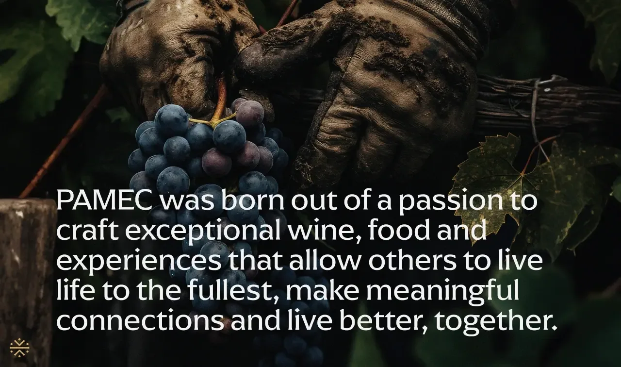
More than a name, PAMEC is a spirit, a fictional but resonant figure drawn from local inspired folklore. A guardian of nature and vegetation. A whisper in the wind. A symbol of sustainability, reverence, and the deep bond between land and steward. With this narrative, we helped the winery feel as though it had always been part of the Valley’s story, even as it added a new and compelling voice.
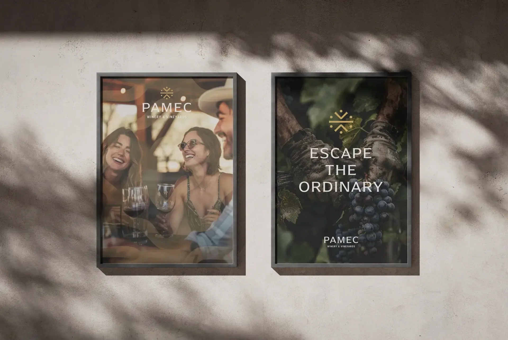
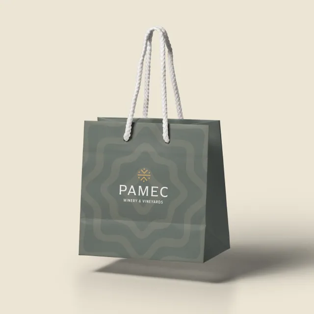
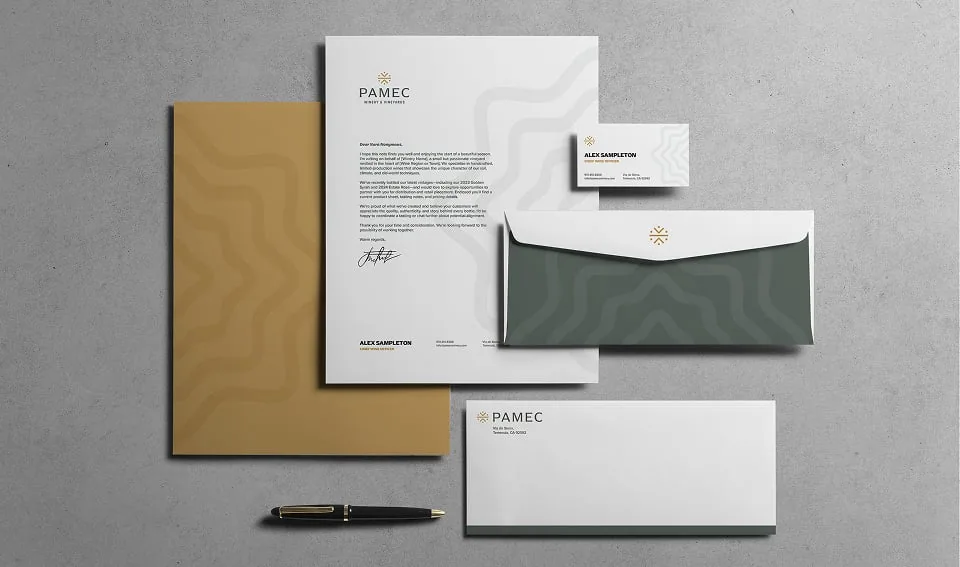
From naming and storytelling to visual identity and packaging, every brand touchpoint was designed to reflect both the mystique of the myth and the grounded integrity of the winemakers behind it. The result? A brand that seamlessly fits into the Temecula wine scene and but one that carved out a distinct place of its own.
PAMEC isn’t just a winery.
It’s a spirit reborn, a heritage continued, and a story only Temecula could tell.

Crafting a Symbol of Connection
A Versatile Identity for a Growing Brand
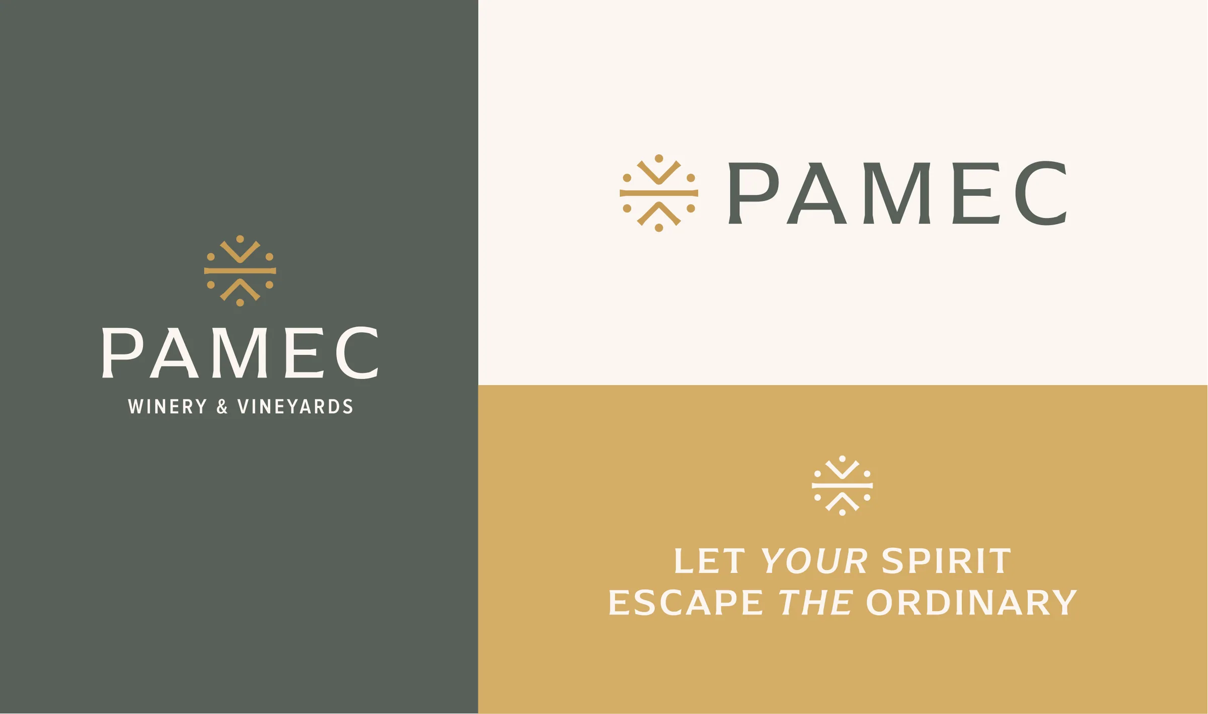
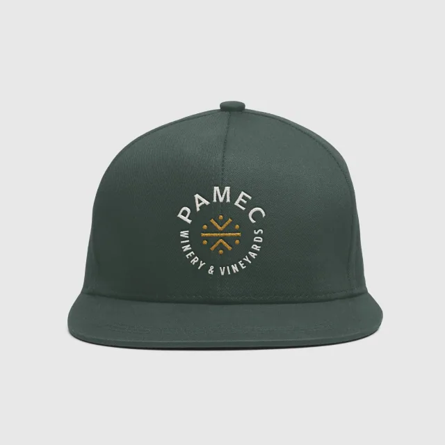
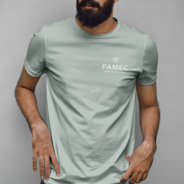
We designed PAMEC’s logo to embody a contemporary, utilitarian aesthetic, a deliberate choice to reflect the brand’s grounded purpose and quiet confidence. Our goal was to create a mark that feels inclusive and intentional, evoking a sense of community while subtly channeling the spirit of the PAMEC myth. With just a trace of native influence, the symbol represents the sun, earth, and people coming together, a nod to both heritage and harmony.
Strategically, the logo was built for flexibility. It adapts across vertical and horizontal formats, with the horizontal version allowing for expandable descriptors like ‘Winery & Vineyards’, ‘Estate Grown Olive Oil’, or ‘Restaurant & Wine Bar’, ensuring the brand can evolve naturally as its offerings grow.
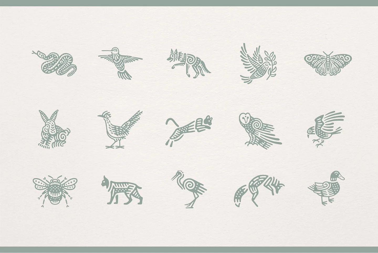

Tasting Notes with a Soul
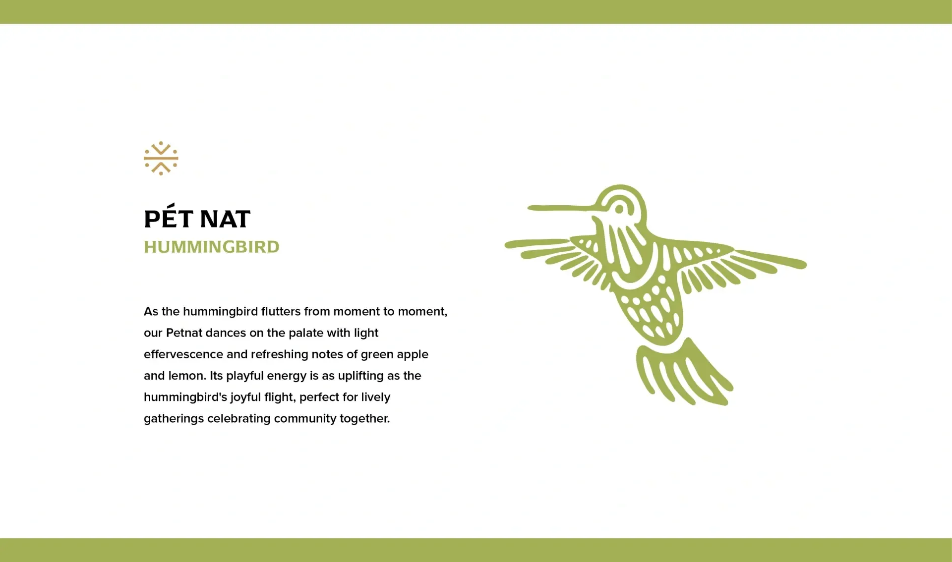
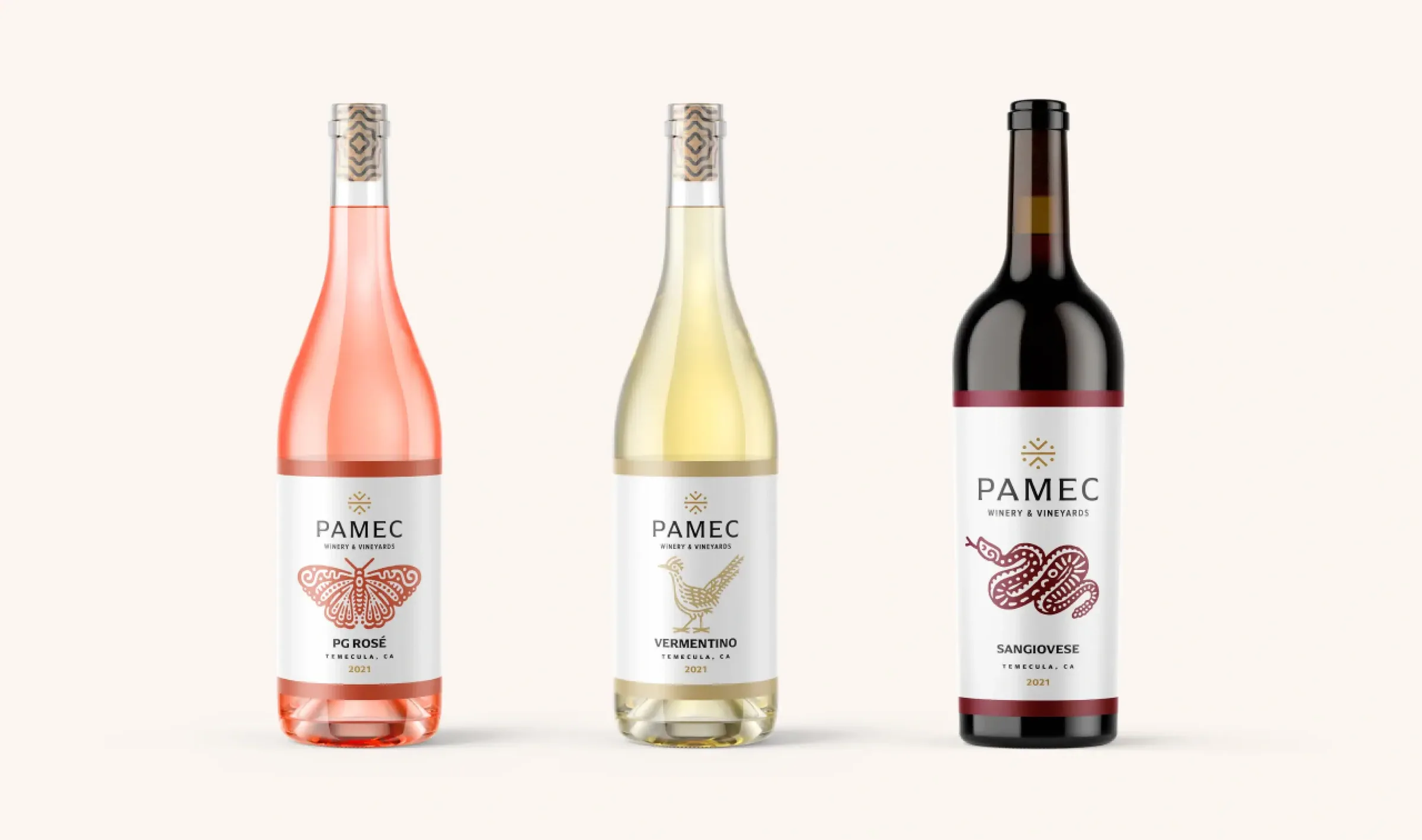
Evocative Descriptions Paired with Spirit Animal Symbols
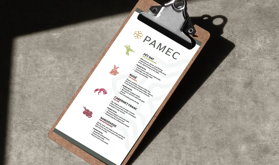
To deepen the emotional connection between wine and drinker, we crafted a series of varietal descriptions that blend precise tasting notes with expressive, story-driven language. Each wine is also paired with a symbolic spirit animal, a visual extension of its character that creates a sensory and symbolic experience that reflects the heart of the PAMEC mythos.
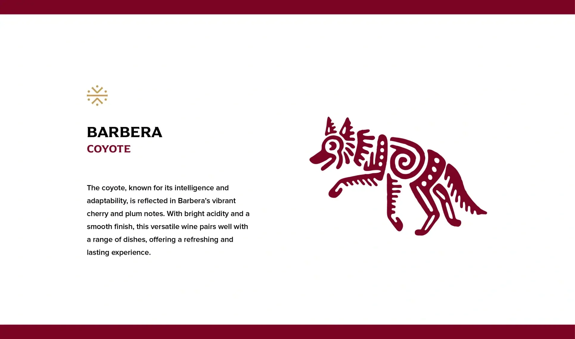

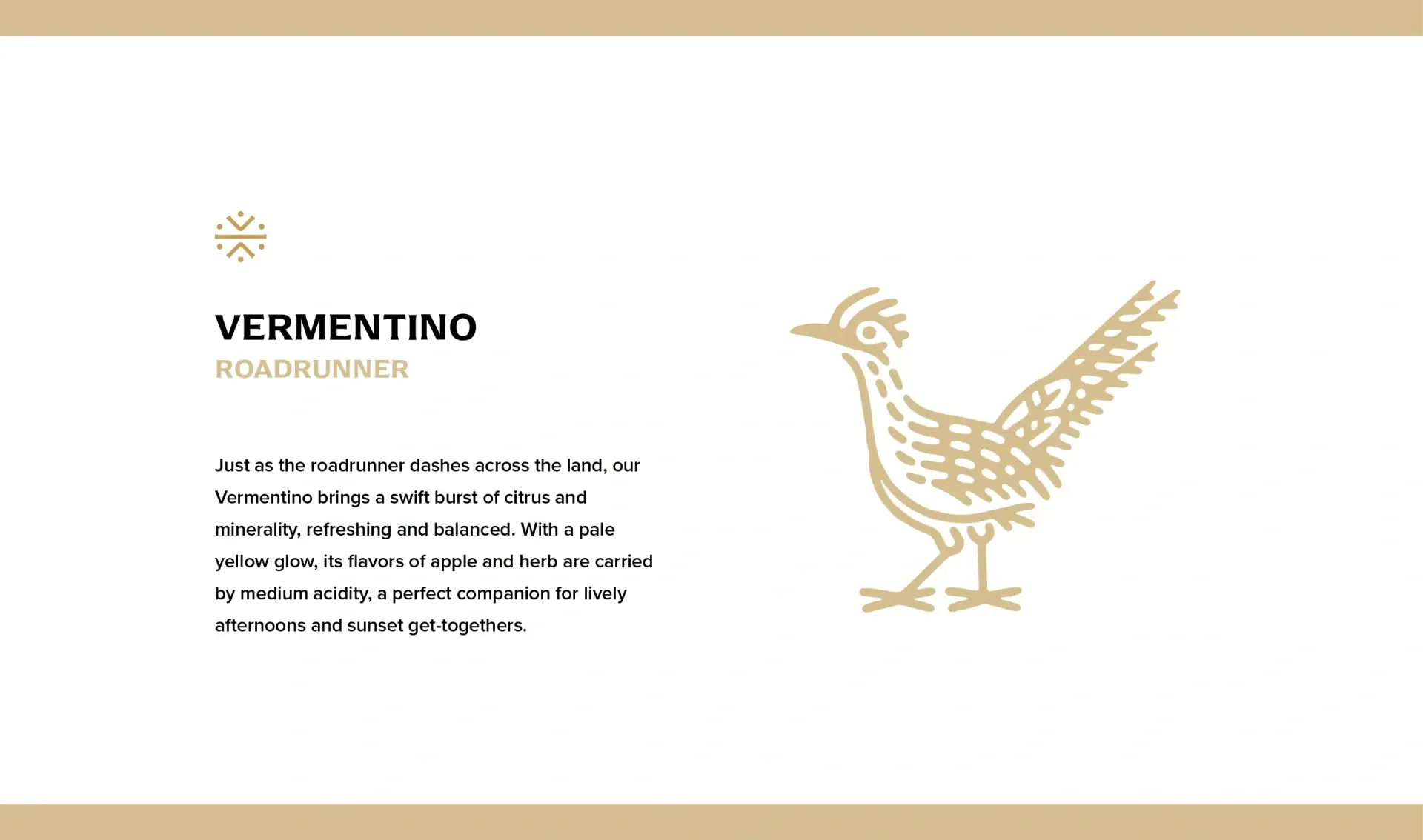

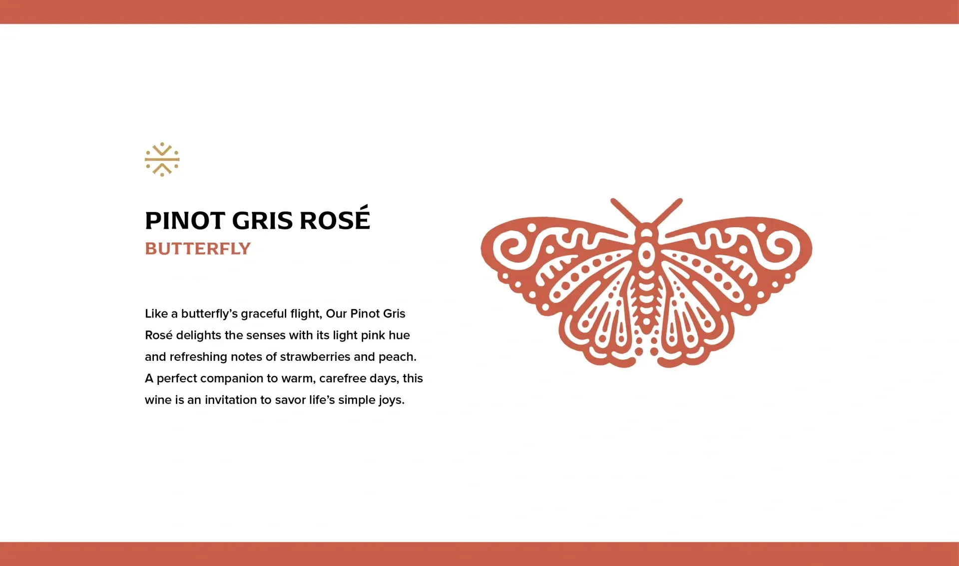
















"We’ve worked with other agencies on other projects, but Magnetic delivers on a much higher level than anyone we worked with before. The work they’ve done to bring PAMEC to life from strategy to visuals is amazing."
Erich Rubio
Brand Intelligence
- Brand Strategy + Development
- Research + Discovery
- Audience Surveys + Workshops
- Naming + Logo Design
Creative Development
- Creative Dev + Messaging
- Packaging Design
- Photo + Video Production
- Brand Asset Creation