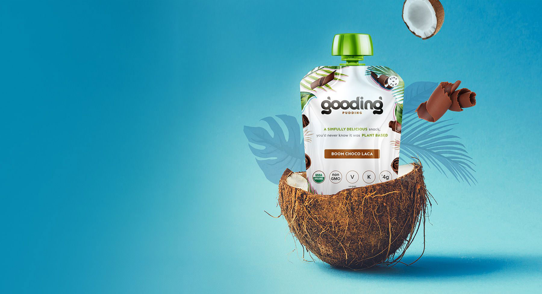
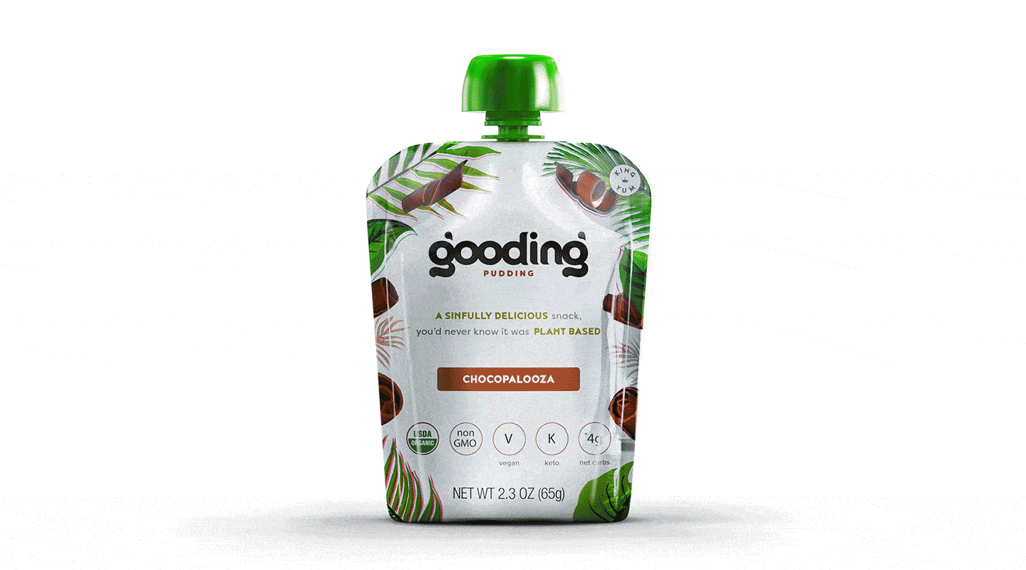
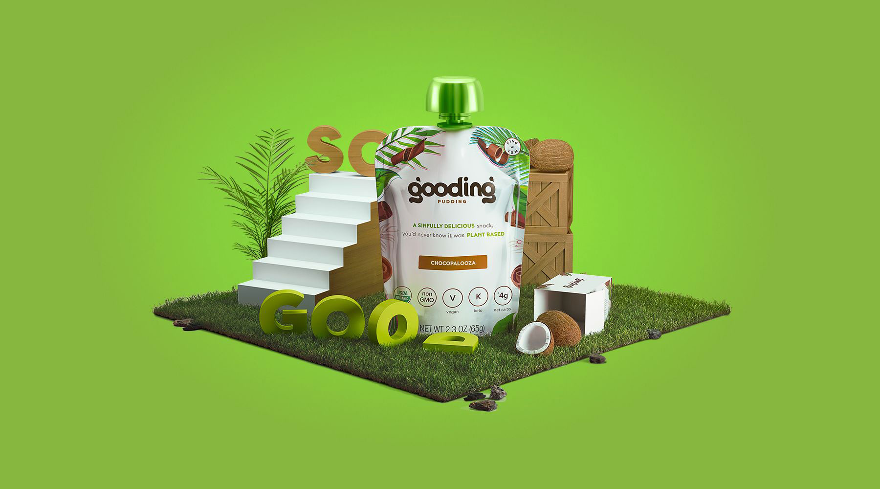
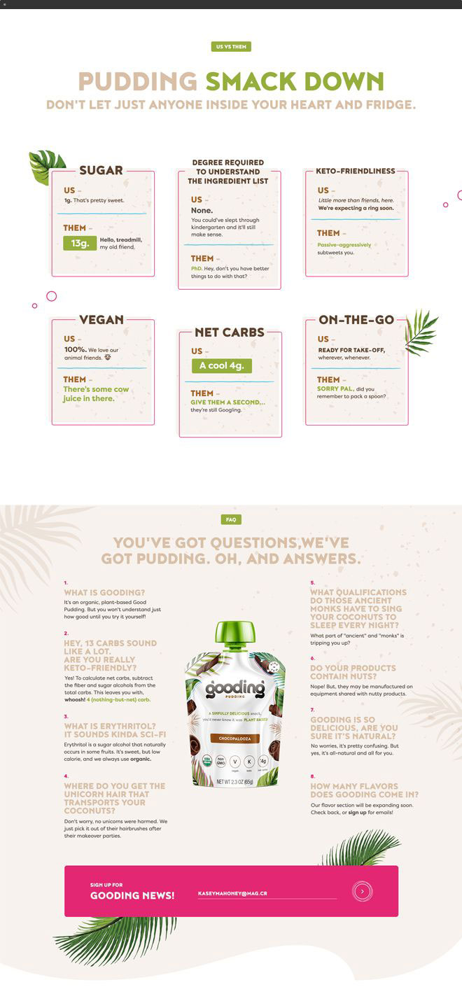
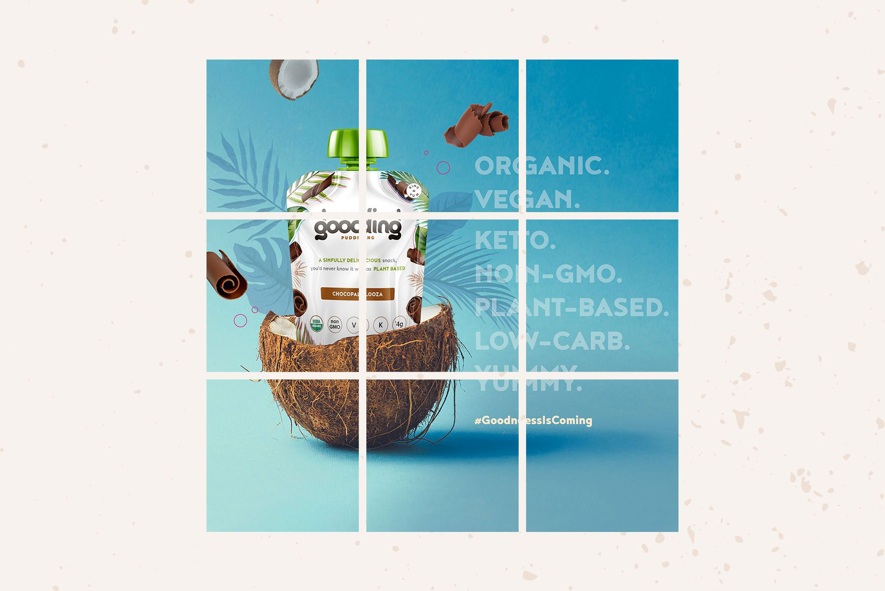
It's Gooding
Gooding
It's Good. It's Pudding. It's Gooding.


Drag


Brand Intelligence
- Research + Discovery
- Naming + Logo Design
- Brand Strategy + Development
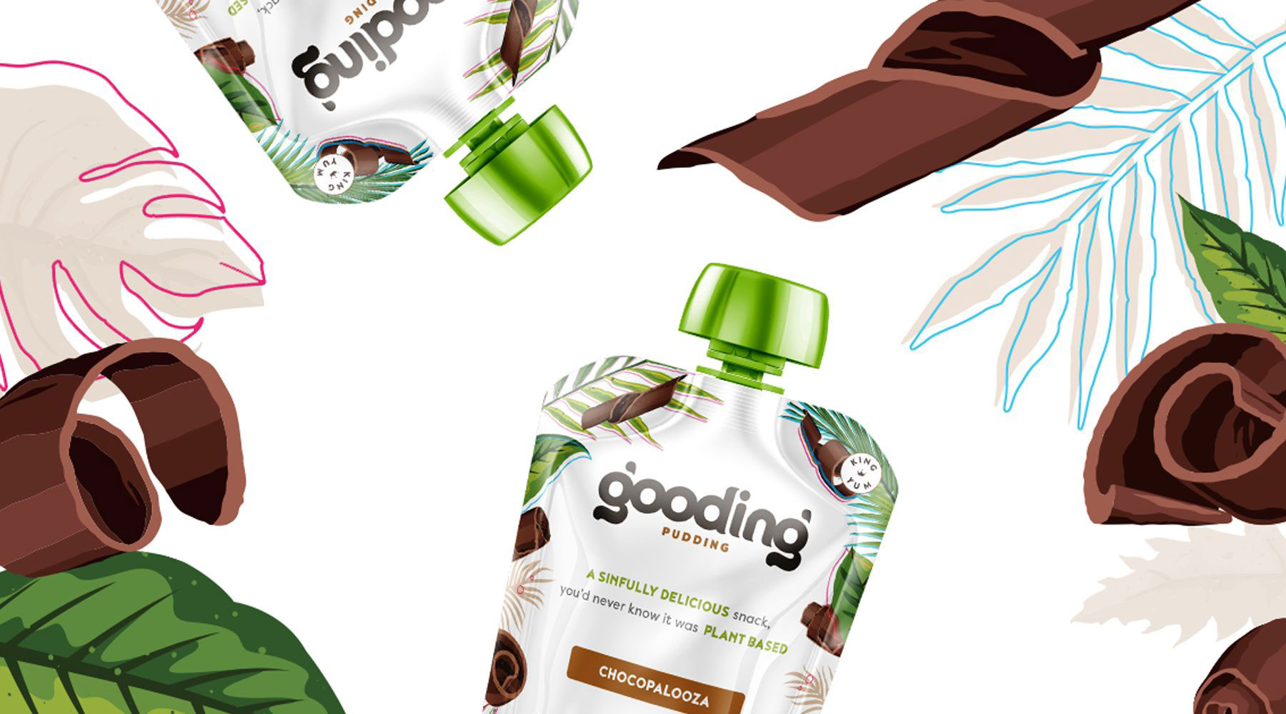
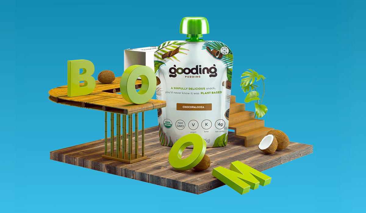
Creative Development
- Creative Dev + Messaging
- Brand Asset Creation
- Photo + Video Production
Growth Marketing
- Reporting + Analytics
- Marketing Activation Plans