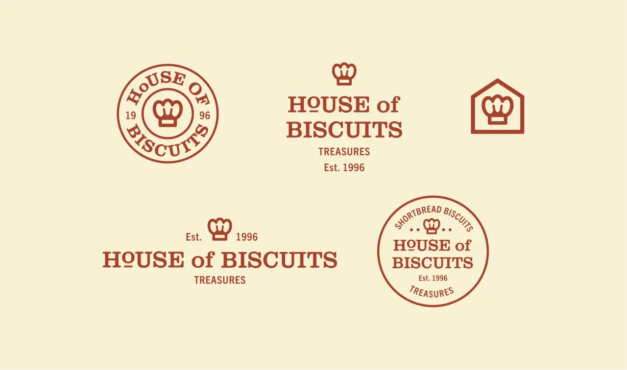
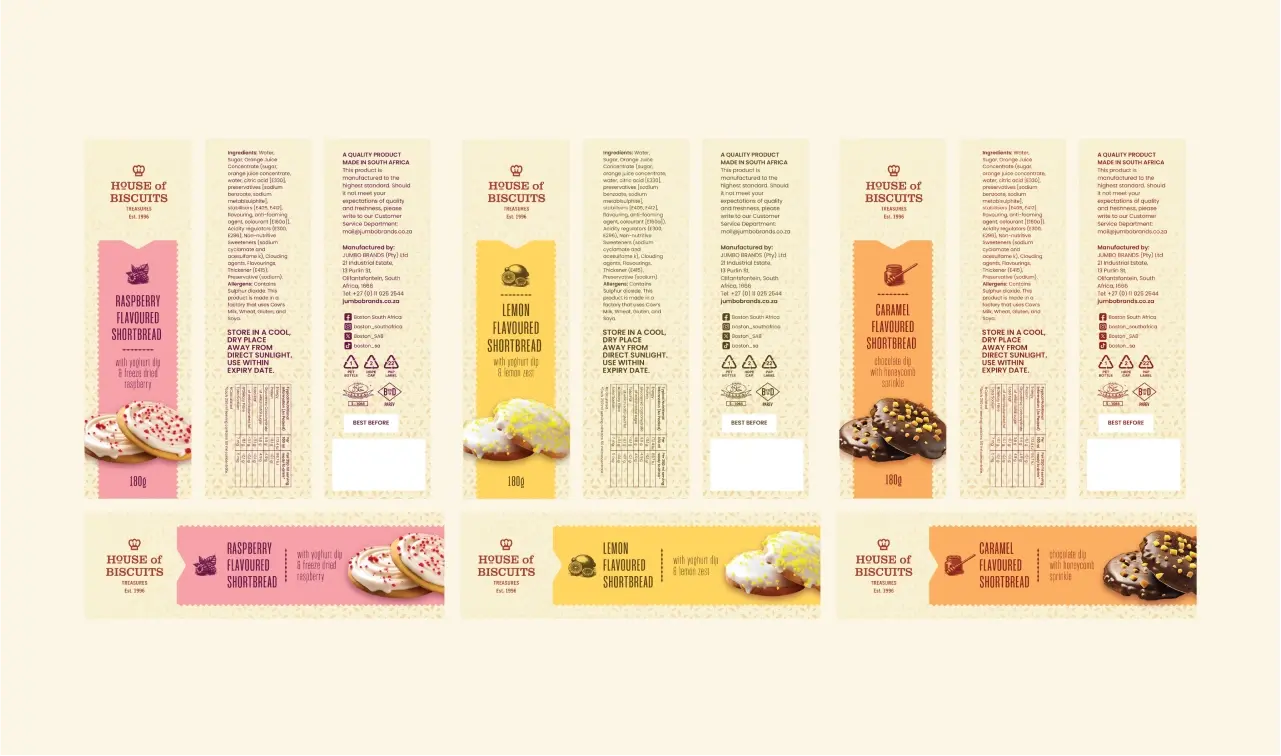
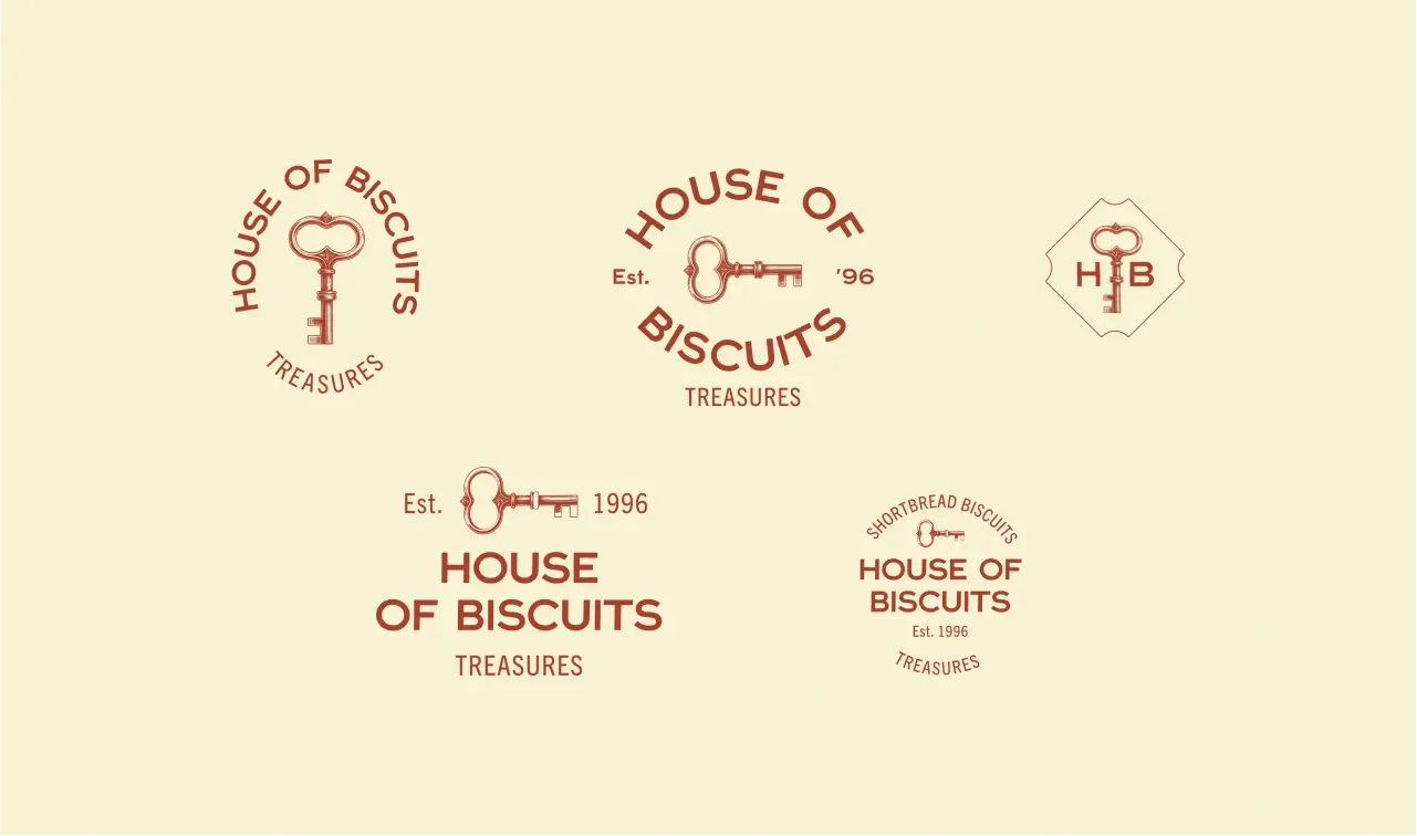
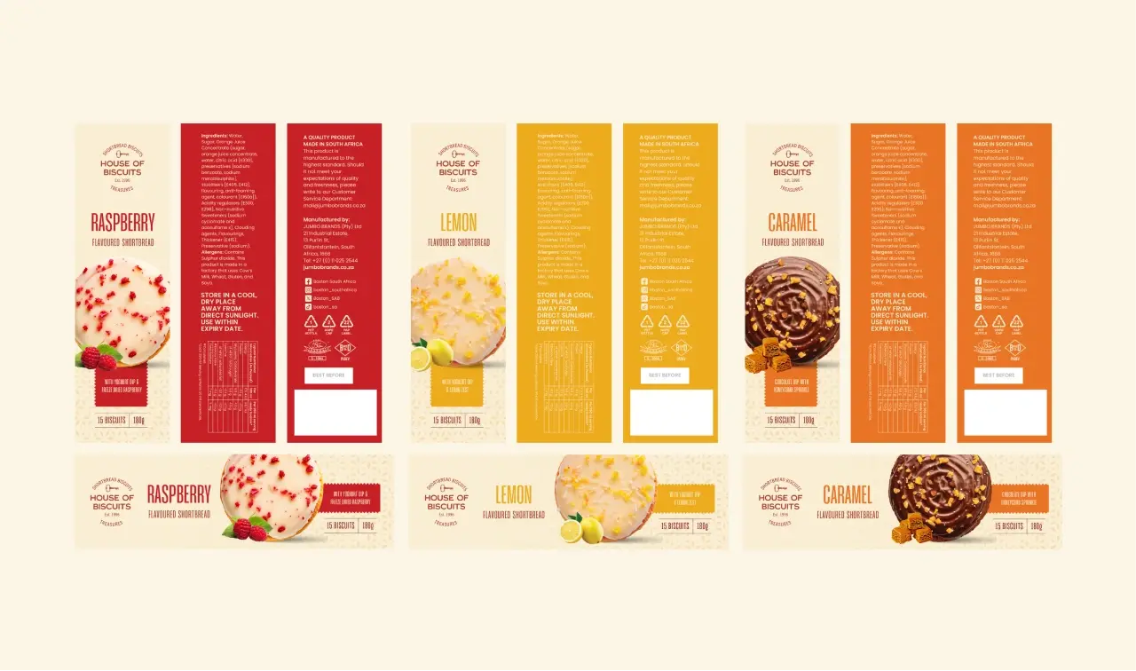
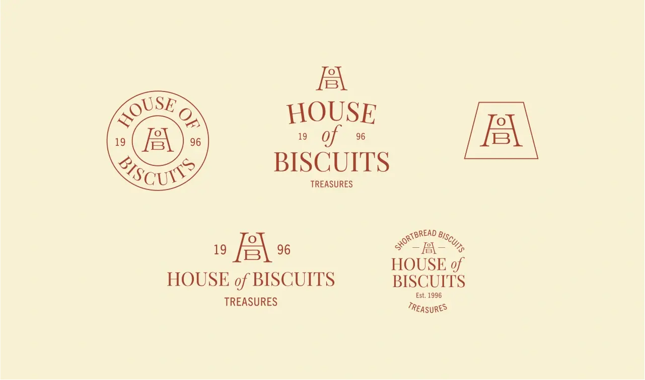
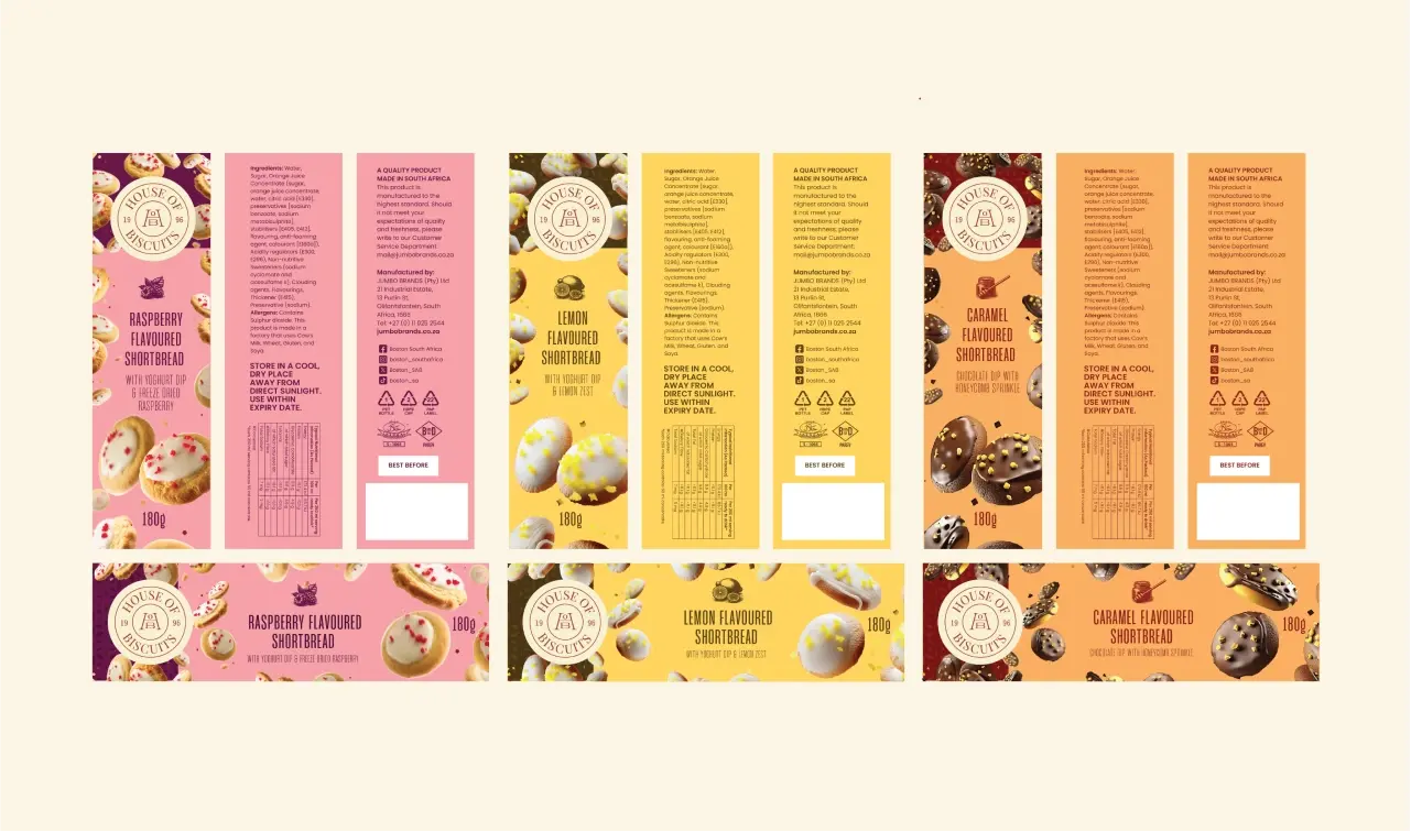
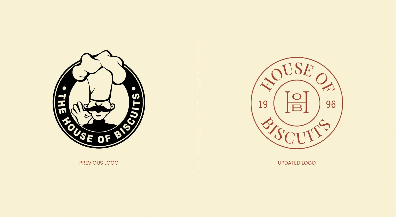
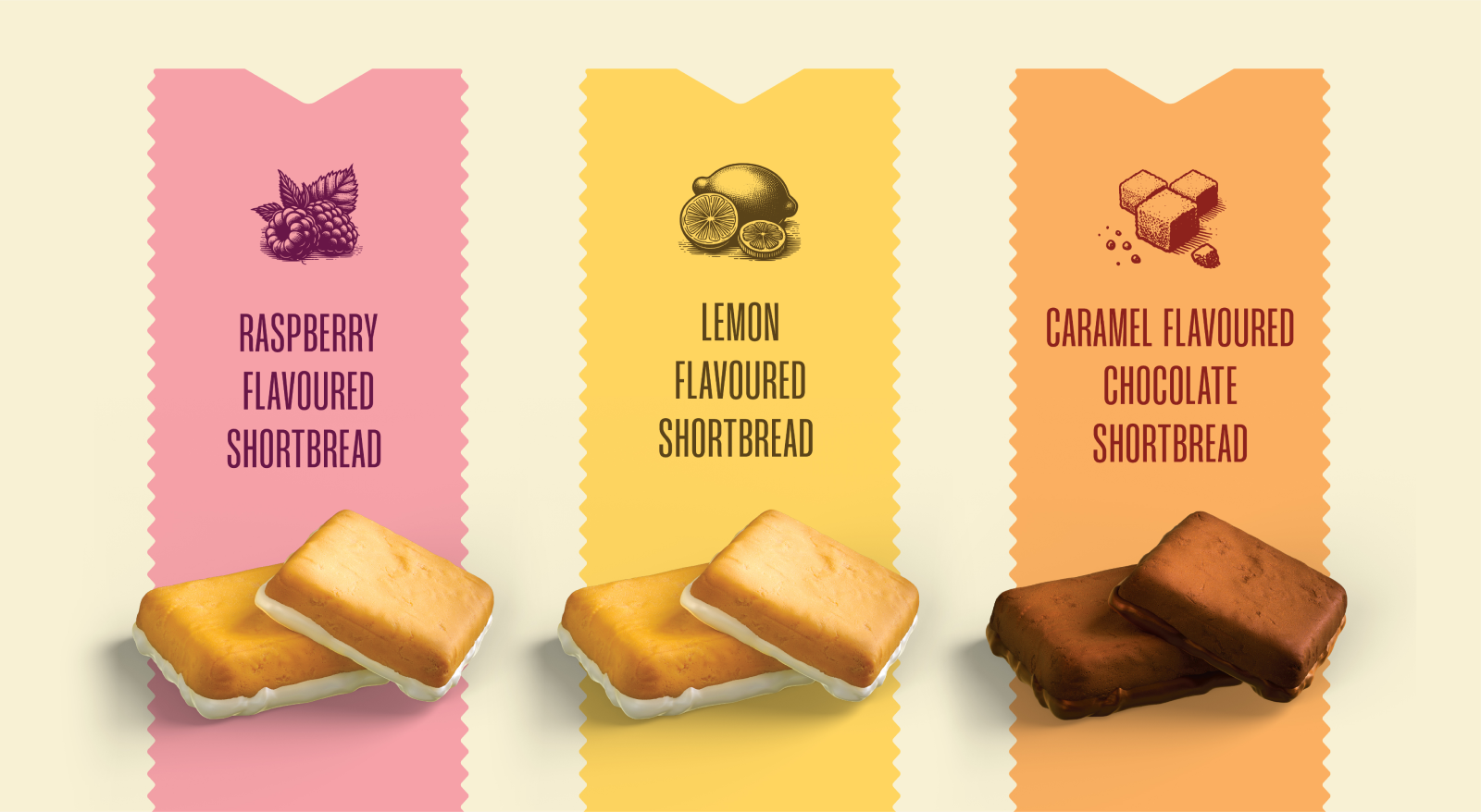
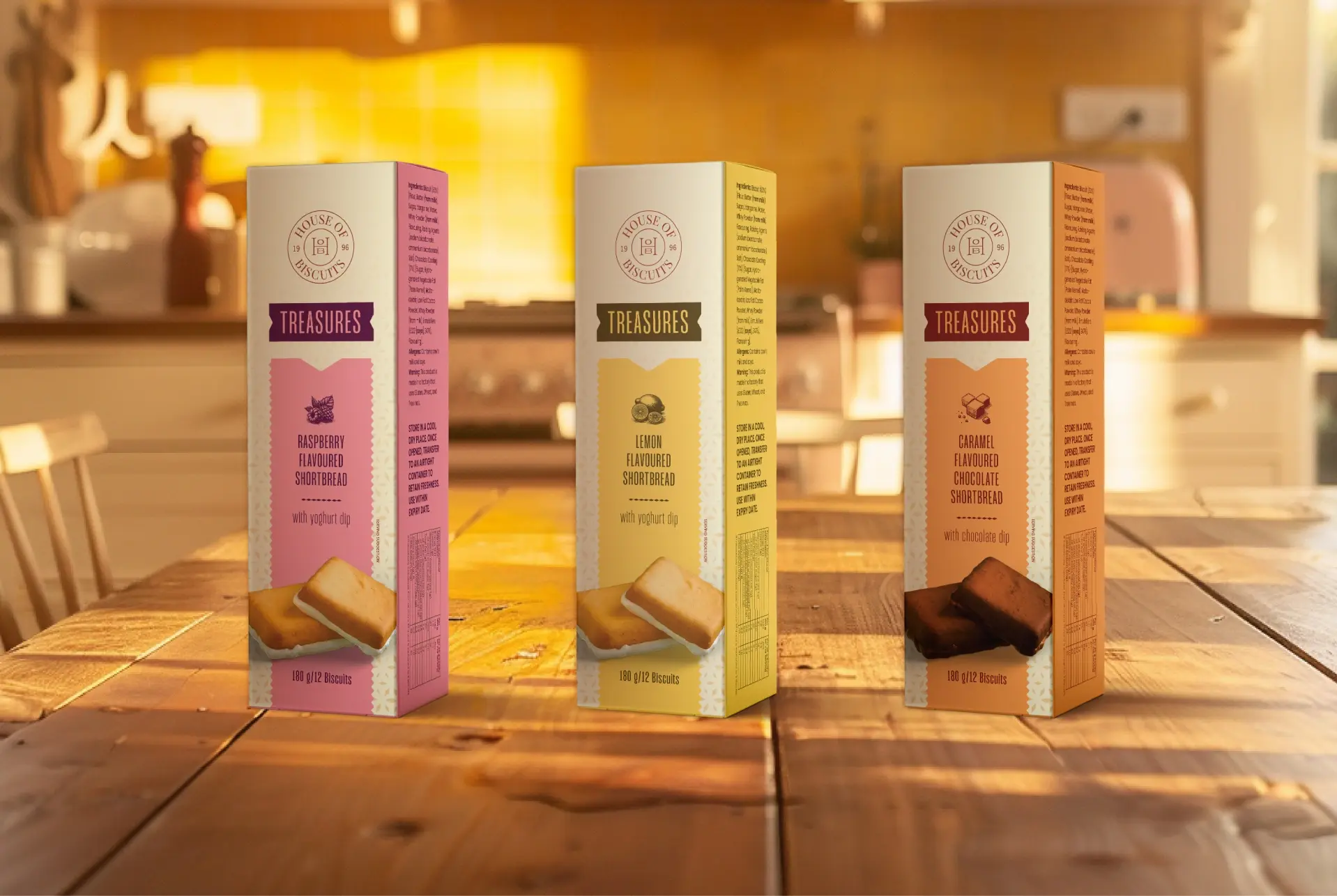
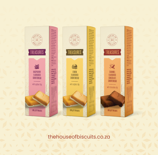
Pamec Winery

Baking up a Better Cookie Brand

How we turned a beloved cookie brand into a treasured treat and household staple.


branding for cookie company

From local favorite to category contender

Reimagining House of Biscuits
for the Next Generation of Indulgence

House of Biscuits is a brand with decades of baking heritage. But even the most beloved traditions need fresh energy to stay relevant. With shifting consumer expectations and increasing competition in the snack aisle, the brand saw the opportunity to refresh everything from its logo to packaging.

Our objectives were clear:
  • Modernize the brand identity to resonate with a new generation of consumers.


  • Develop a refined logo system that communicates premium quality.

  • Create playful yet elevated product names to enhance brand personality.

  • Design eye-catching packaging that instantly communicates flavor, quality, and indulgence.

The result is a thoughtfully redesigned brand that honors its legacy while confidently stepping into a premium space—sophisticated, warm, and irresistibly delicious.
LOGO & PACKAGING MOOD BOARD REFERENCE LOGO & PACKAGING MOOD BOARD REFERENCE
LOGO & PACKAGING MOOD BOARD REFERENCE
a brand in search of its sweet spot

Three Key Ingredients in the Recipe for Relevance

To establish a strong visual identity for House of Biscuits, we developed three distinct creative directions. Each route offers a different lens on the brand’s story – one looking to the past, one inviting people in, and one blending timelessness with playful modernity.

1. A Nod to the Past

Inspired by the original House of Biscuits logo, this concept retains its most iconic element: the chef’s hat. Simplified and refined, the result is a modern heritage mark that feels instantly familiar. The packaging employs gentle tones, clean layouts, and subtle patterns to evoke trust, nostalgia, and warmth.

Logo design for House of Biscuits Snack Brand Logo design for House of Biscuits Snack Brand
Packaging design for House of Biscuits Snack Brand Packaging design for House of Biscuits Snack Brand
Drag
2. Make Yourself at Home

This direction celebrates House of Biscuits as a symbol of welcome and delight. A hand-drawn key anchors the logo, representing generosity, hospitality, and the joy of unwrapping something special. Rich, saturated colors and accessible typography give the packaging a confident yet comforting presence.

Logo design for House of Biscuits Snack Brand Logo design for House of Biscuits Snack Brand
Packaging design for House of Biscuits Snack Brand Packaging design for House of Biscuits Snack Brand
Drag
3. Modern Nostalgia

This approach introduces a bold, contemporary monogram crafted from the letters H, O, and B. Echoing vintage biscuit tins and classic emblems, the logo bridges past and present. The packaging features dynamic photographic textures and playful floating biscuits layered over vibrant backgrounds, evoking childhood memories in a fresh and engaging way.

Logo design for House of Biscuits Snack Brand Logo design for House of Biscuits Snack Brand
Packaging design for House of Biscuits Snack Brand Packaging design for House of Biscuits Snack Brand
Drag

heritage meets modern appeal

A Clearer Identity Comes to Life

This phase marked a meaningful evolution toward clarity and sophistication. We transitioned from the original chef character into a more timeless, iconic mark –anchored firmly in heritage yet refreshed for today. Retaining the strength of the monogram from our earlier exploration, we carefully refined it into the final HOB logo, balancing warmth with artisanal quality for a confident, enduring presence.

We also introduced color inspired directly by flavor, crafting a comforting palette of warm, pastel-like tones. Each package now prominently features a crisp product image, a detailed flavor illustration, and the signature cream pattern that anchors the brand’s new visual system, enhancing shelf appeal and stirring appetites. 

Logo refresh for snack brand Logo refresh for snack brand
OLD VS. NEW LOGO COMPARISON
snack brand packaging illustration snack brand packaging illustration
FLAVOR COLORWAYS, ILLUSTRATED FLAVOR SIGNIFIERS & BISCUIT RENDERS
snack brand packaging design snack brand packaging design
FINAL Boxed PACKAGING

A digital home for everyday delight

Bringing House of Biscuits to Life Across Every Scroll, Smile, and Sweet Moment

Social media became a natural extension of House of Biscuits' warmth, charm, and everyday joy. Here, the signature pattern gently anchors the visual storytelling, fostering familiarity and recognition. Feel-good photography adds depth and soul, reminding audiences these biscuits are meant to be shared, savored, and celebrated.

The product remains central – each biscuit pack thoughtfully placed, warmly lit, and proudly showcased. The result is a cohesive, inviting, and polished digital presence that honors the brand’s nostalgic roots while staying fresh and relevant.

snack brand social media design snack brand social media design
SOCIAL POST | TYPE ONLY
snack brand social media design snack brand social media design
SOCIAL POST | LIFESTYLE
snack brand social media design snack brand social media design
SOCIAL POST | PRODUCT HERO
Drag

"It’s easy to overlook the small rituals that shape our lives. With House of Biscuits, we saw a chance to celebrate them. We crafted a brand rooted in nostalgia and full of warmth. One that feels both emotionally resonant and commercially confident. It has been a privilege to help bring that story to life."

JEAN-PAUL BROUARD

SENIOR DESIGNER

snack brand advertising design snack brand advertising design
Billboard & ooh concept
Brand Intelligence
  • Brand Strategy + Development
  • Research + Discovery
  • Audience Surveys + Workshops
  • Naming + Logo Design
Creative Development
  • Creative Dev + Messaging
  • Packaging Design
  • Photo + Video Production
  • Brand Asset Creation