Baxter Health
Designing for compassionate care
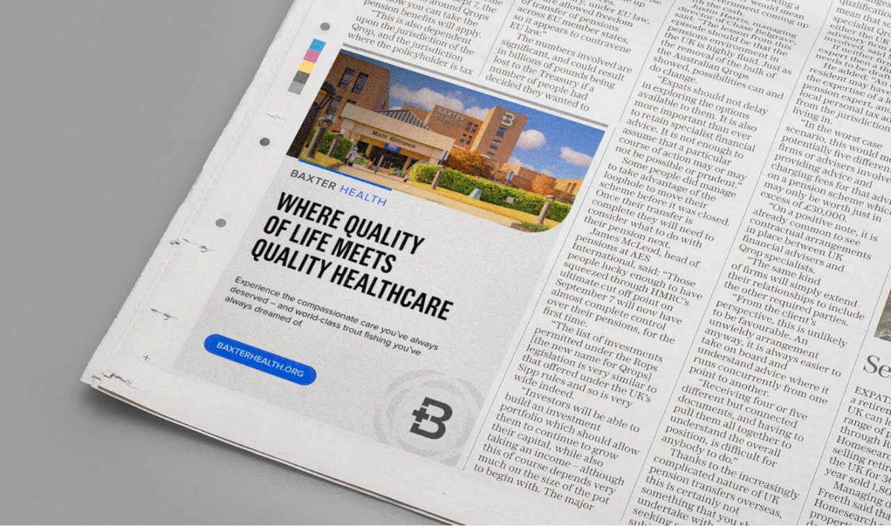
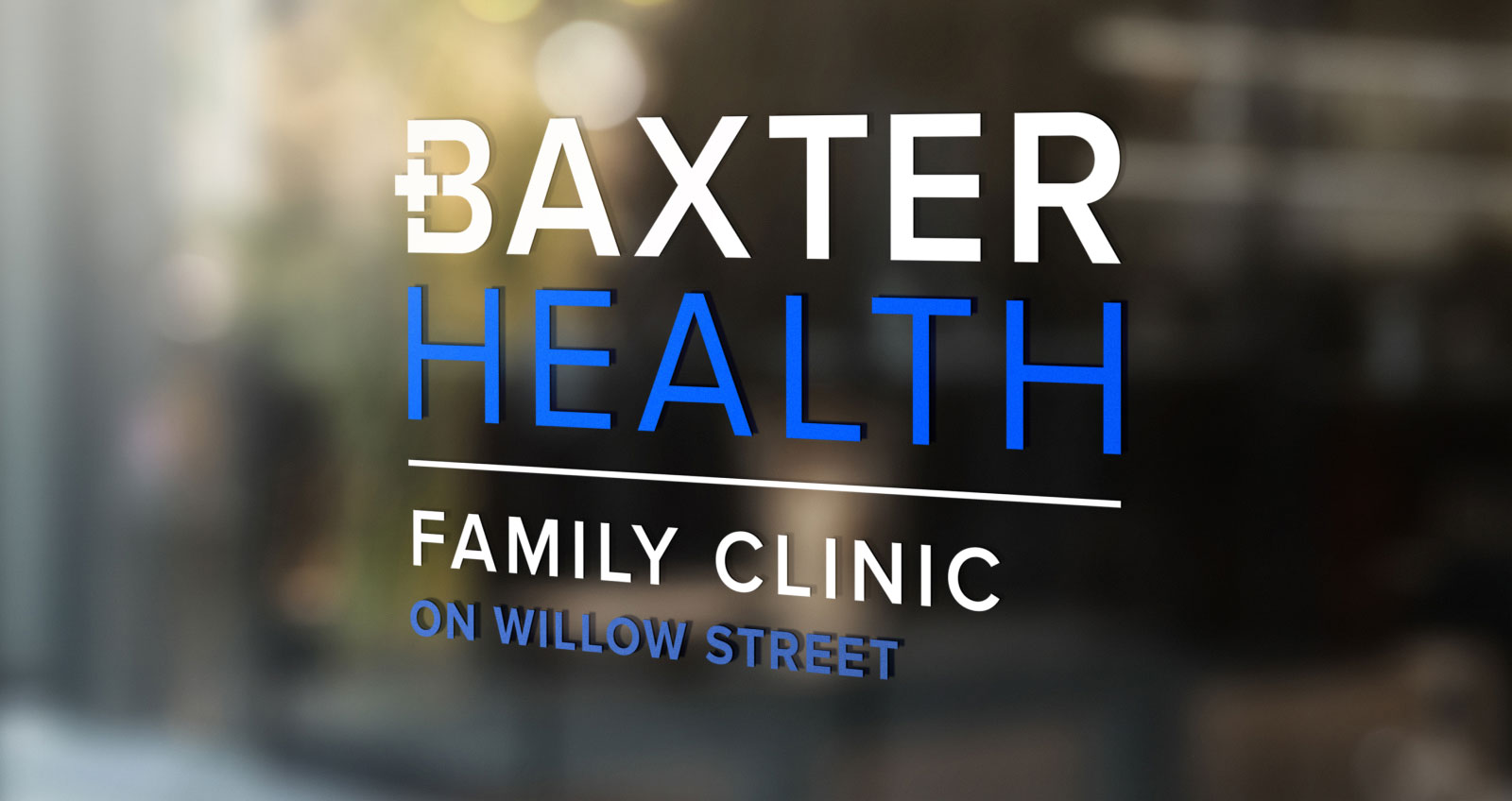
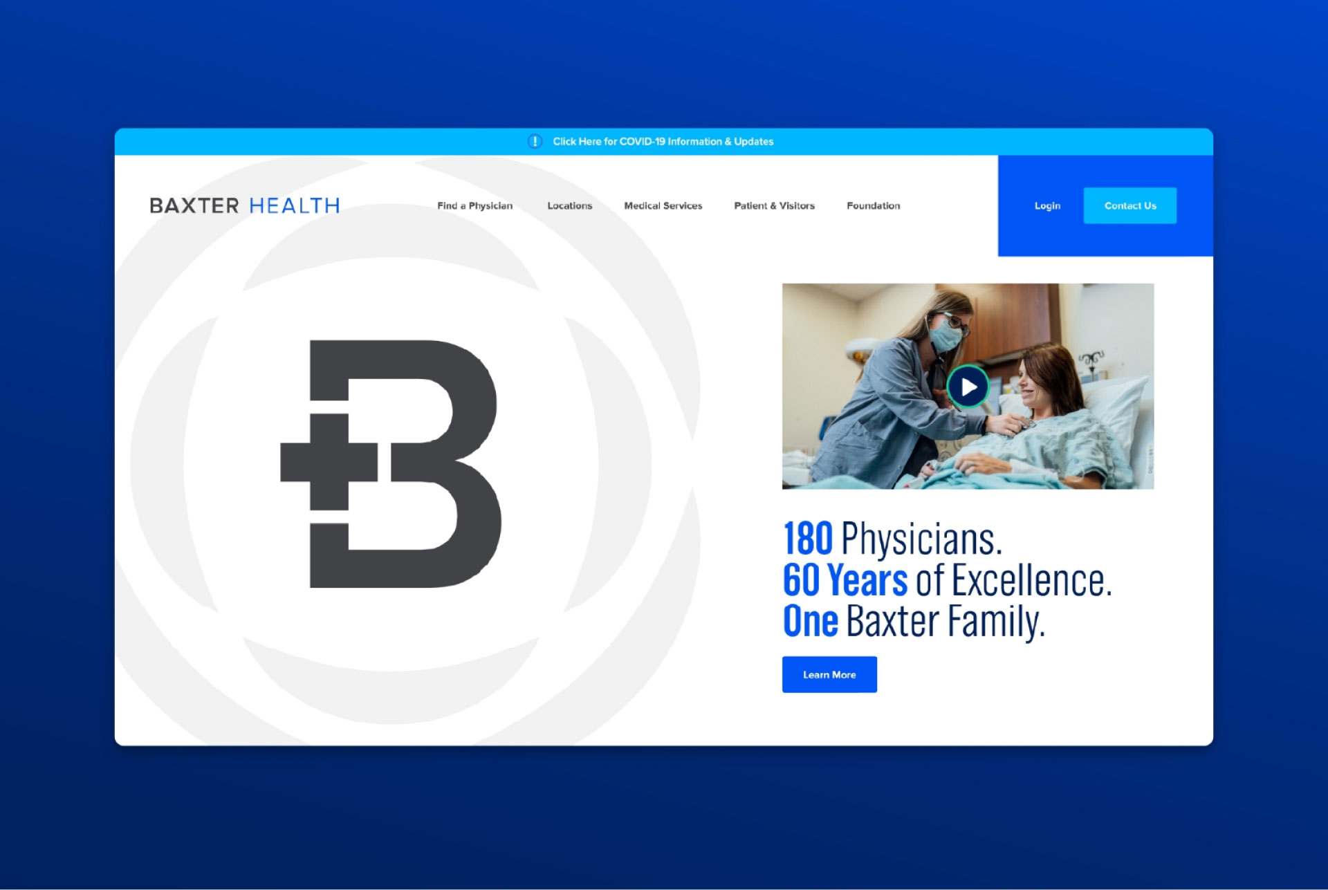
Rebranding an entire health network

Drag


Drag


-
![Baxter Health bag design]()

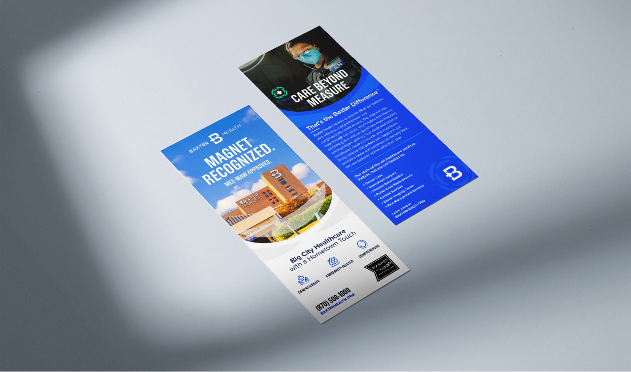
Bag Design -
![Baxter Health bag design blue]()

Bag Design


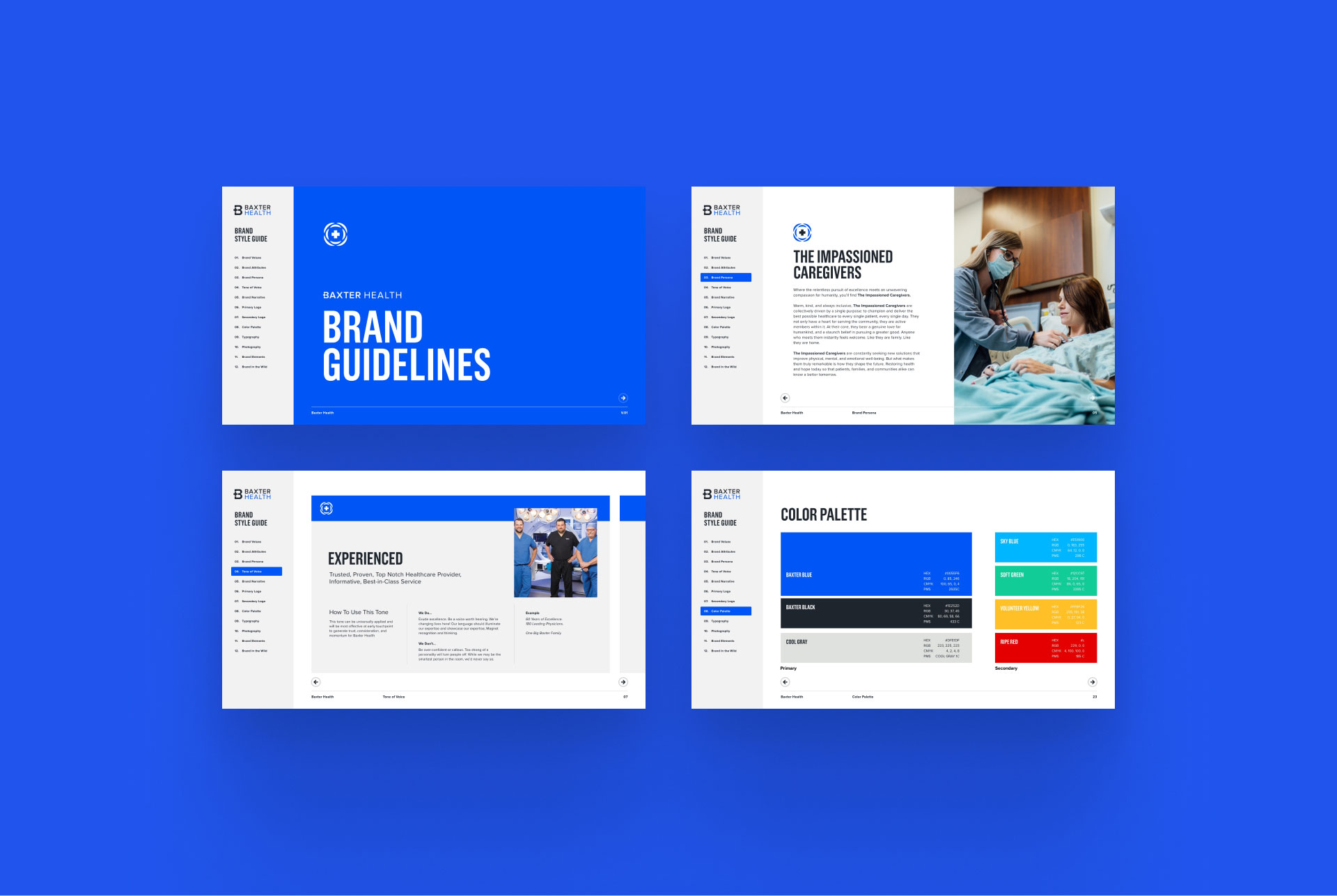
Brand Intelligence
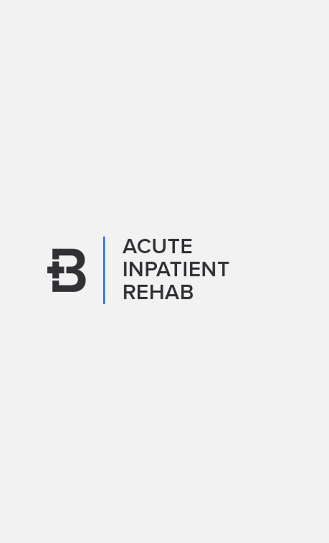
- Naming + Logo Design
- Brand Strategy + Development
Creative Development
- Creative Dev + Messaging
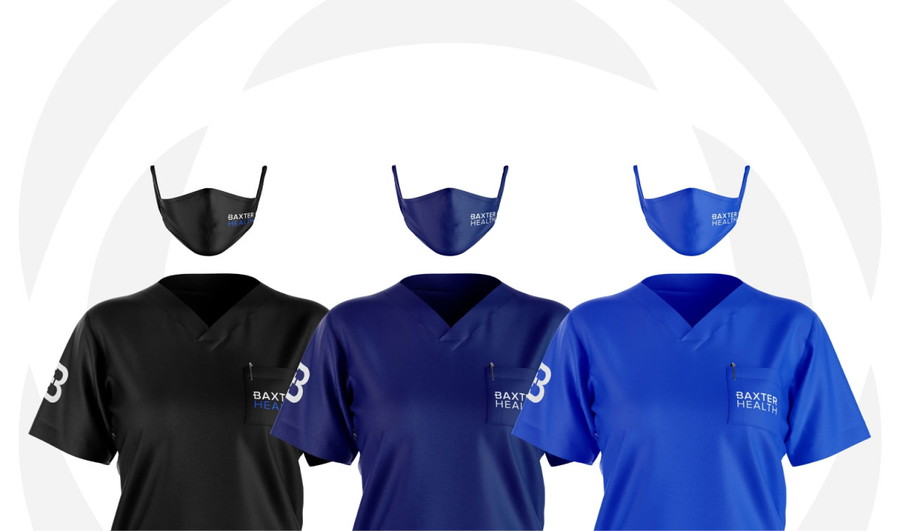
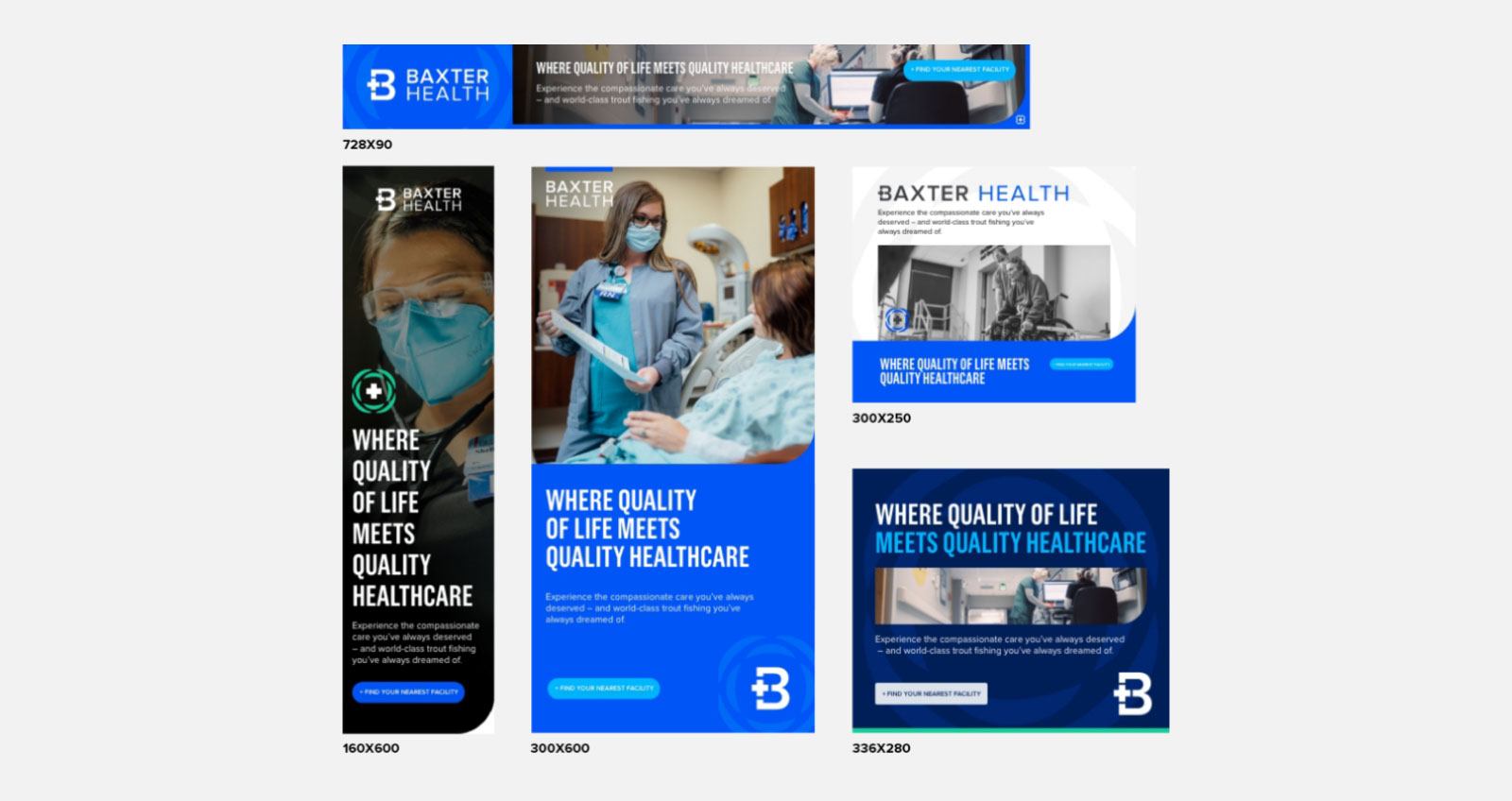
- Brand Asset Creation